Overview:
Victory Lap is Australia’s newest sports marketing and creative summit, bringing together marketers, creatives and strategists from teams, leagues, brands, broadcasters, agencies and athletes across Australia, New Zealand and beyond.
For its inaugural event in 2026, we were starting completely from scratch. Victory Lap needed more than a logo - it needed a brand people would notice, remember and want to be part of. One that could help establish the event from day one, reflect its challenger mentality and carry all the way from the first announcement through to the two-day live experience.
Challenge:
Launching a new event meant building a brand with no existing recognition, visual equity or history to lean on.
Victory Lap was deliberately positioned as “not another sports conference”, so the identity couldn't feel like one either. It needed enough personality to stand apart from the traditional corporate conference look, while still feeling credible enough to attract leading global speakers, brands, partners and attendees.
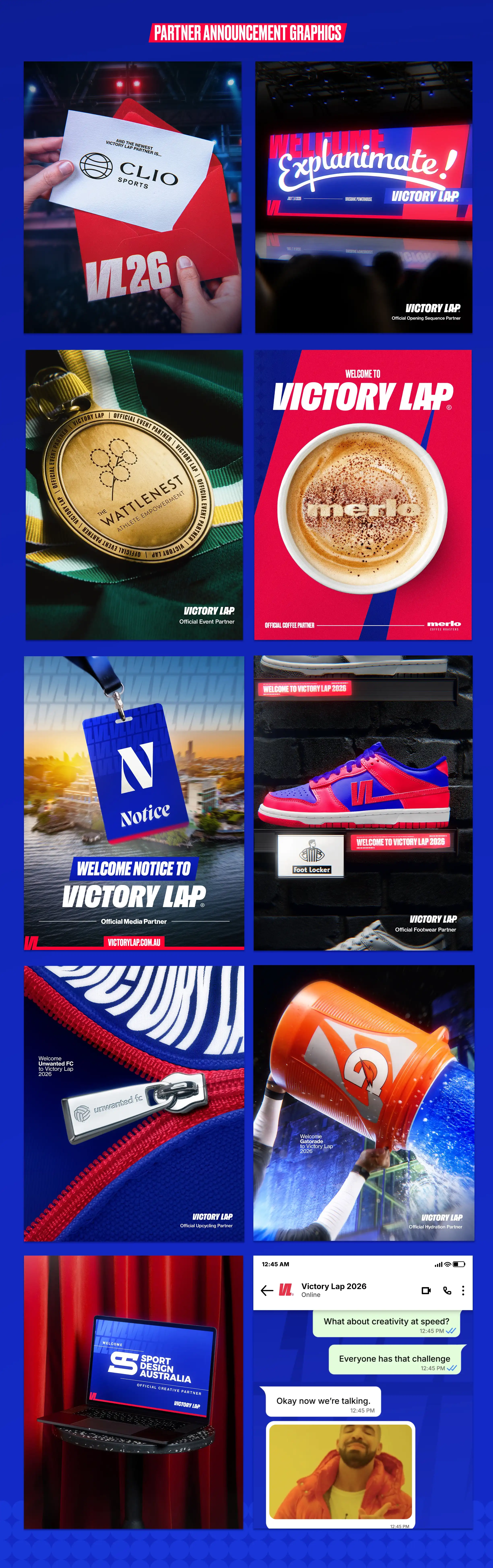
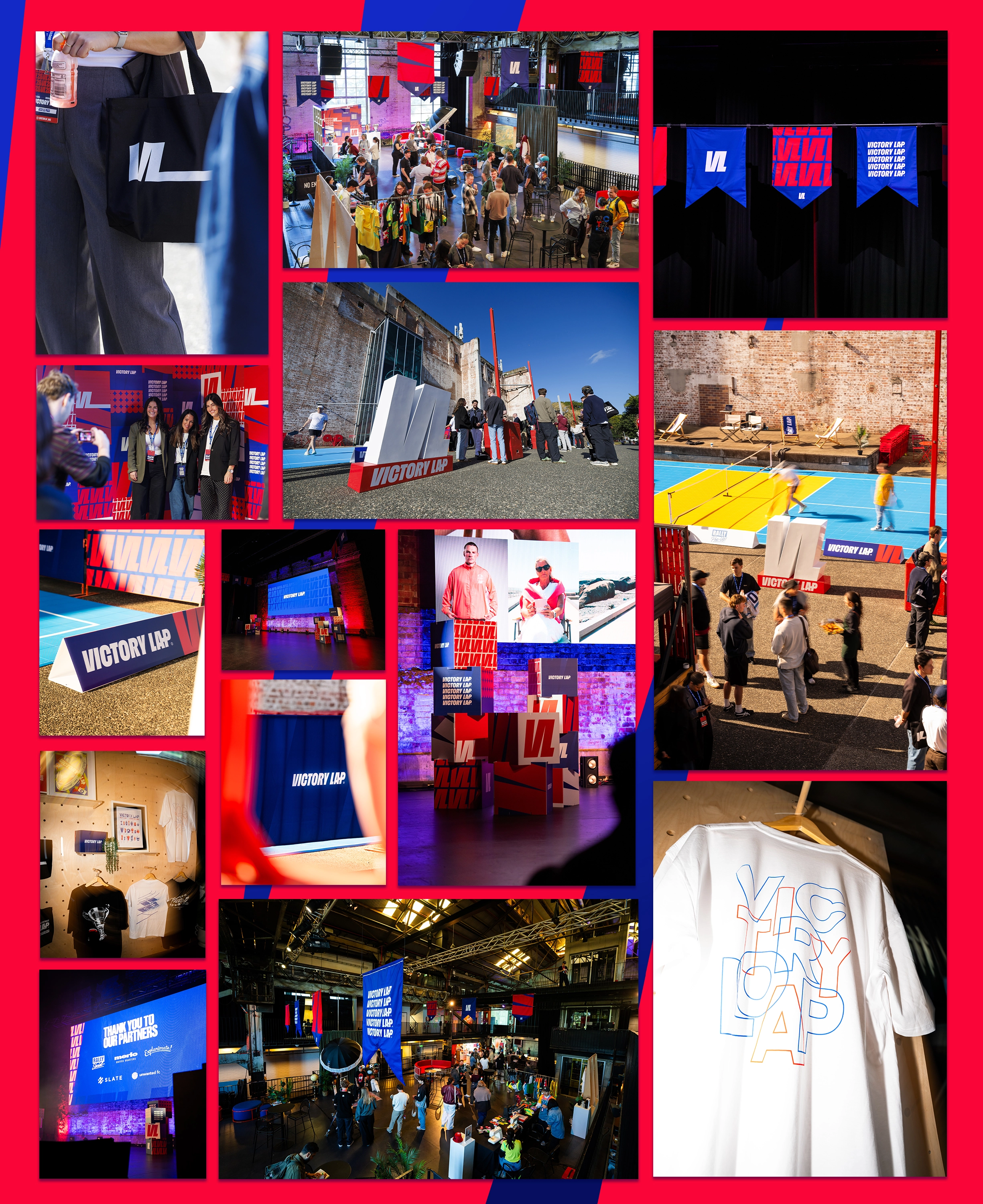
There was also a practical challenge. The identity needed to work across a huge number of applications - from speaker announcements and social content to presentations, signage, merchandise, credentials, screens and the venue itself.
With so many touchpoints across the lead-up and the event, we needed enough flexibility to keep things interesting without losing what made the brand recognisably Victory Lap.
Solution:
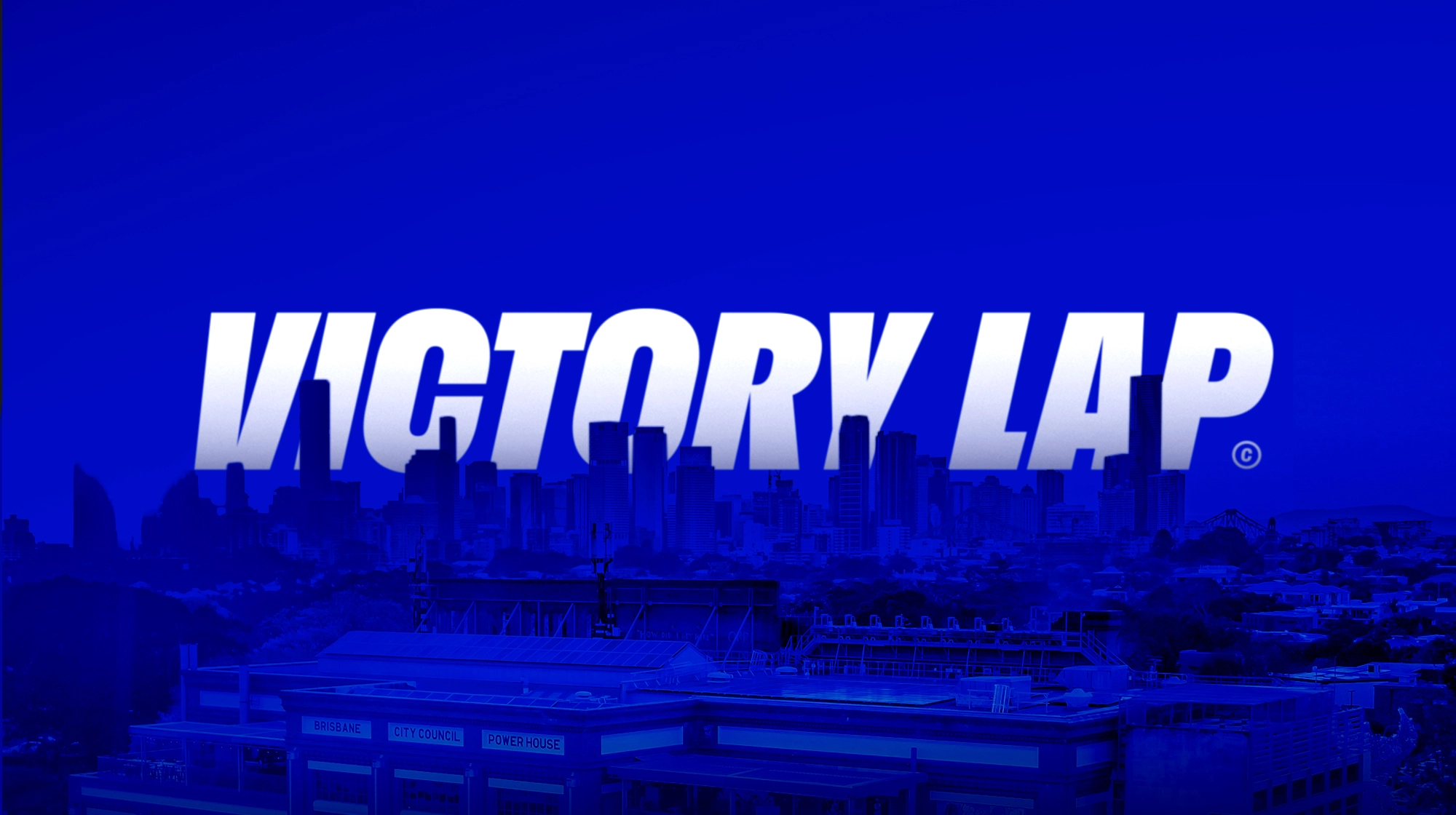
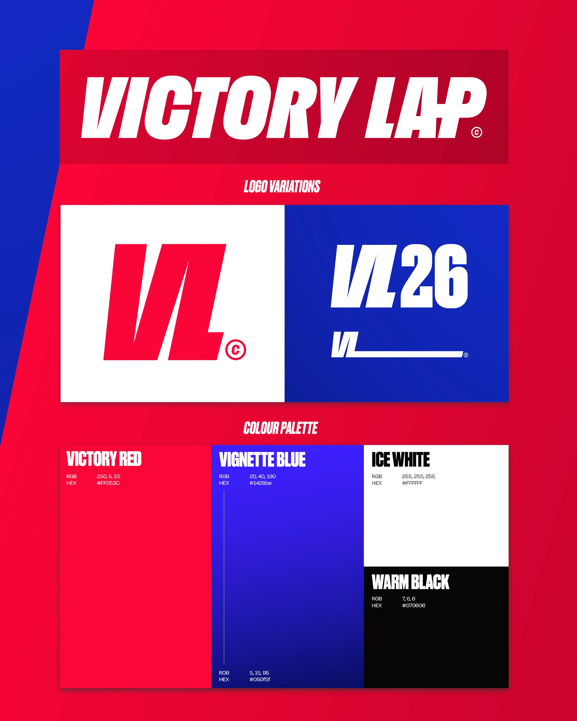
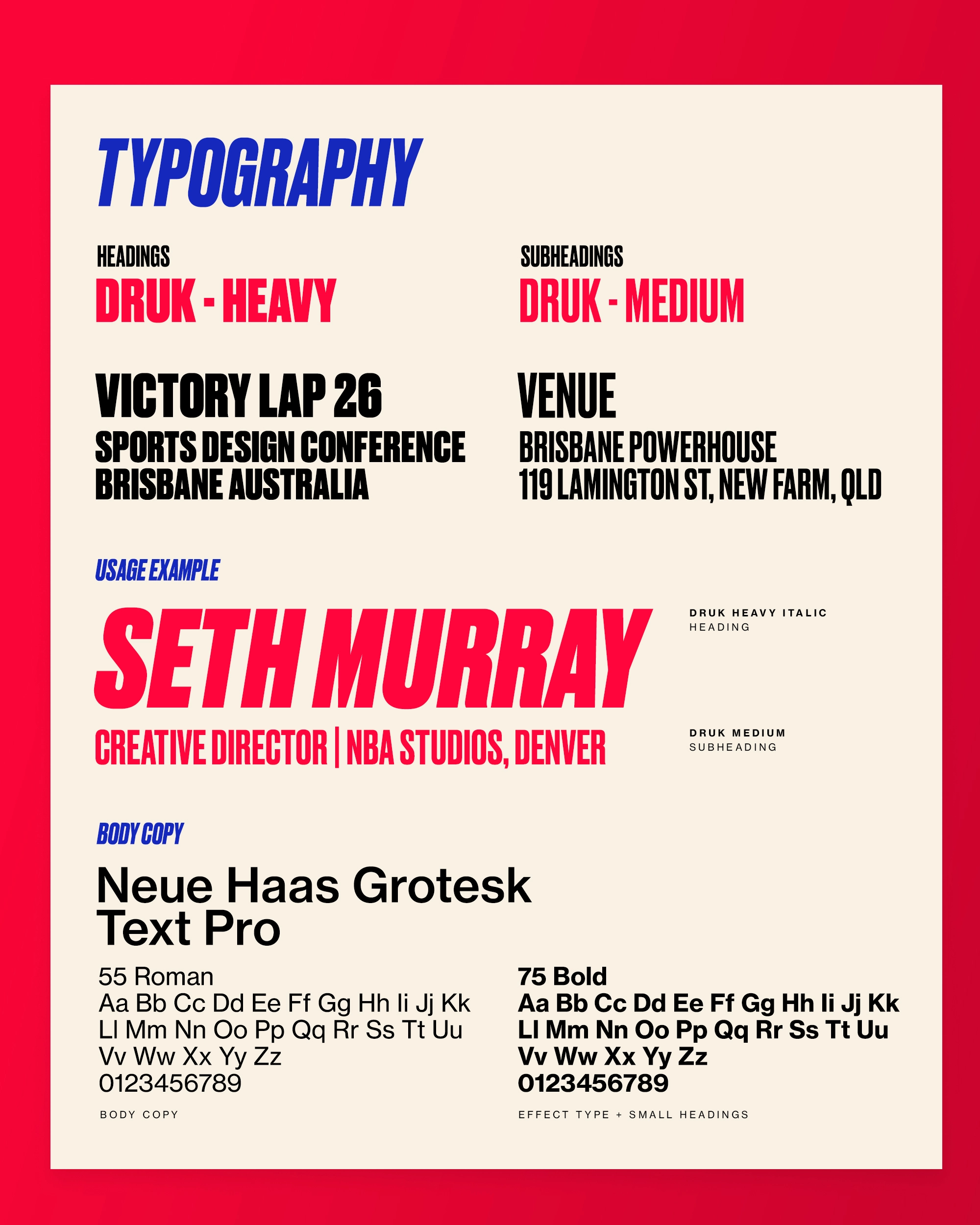
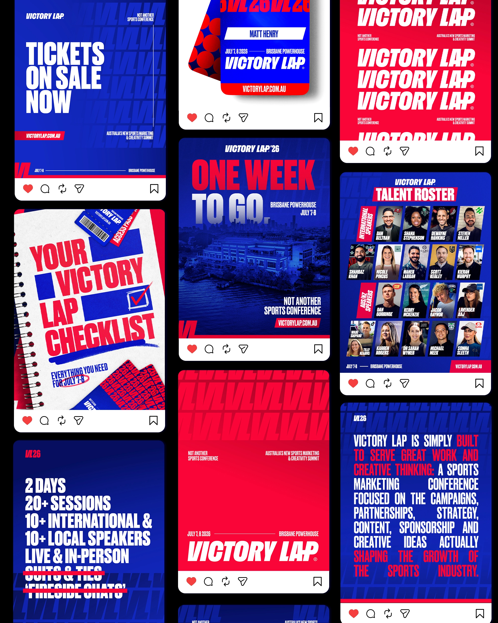
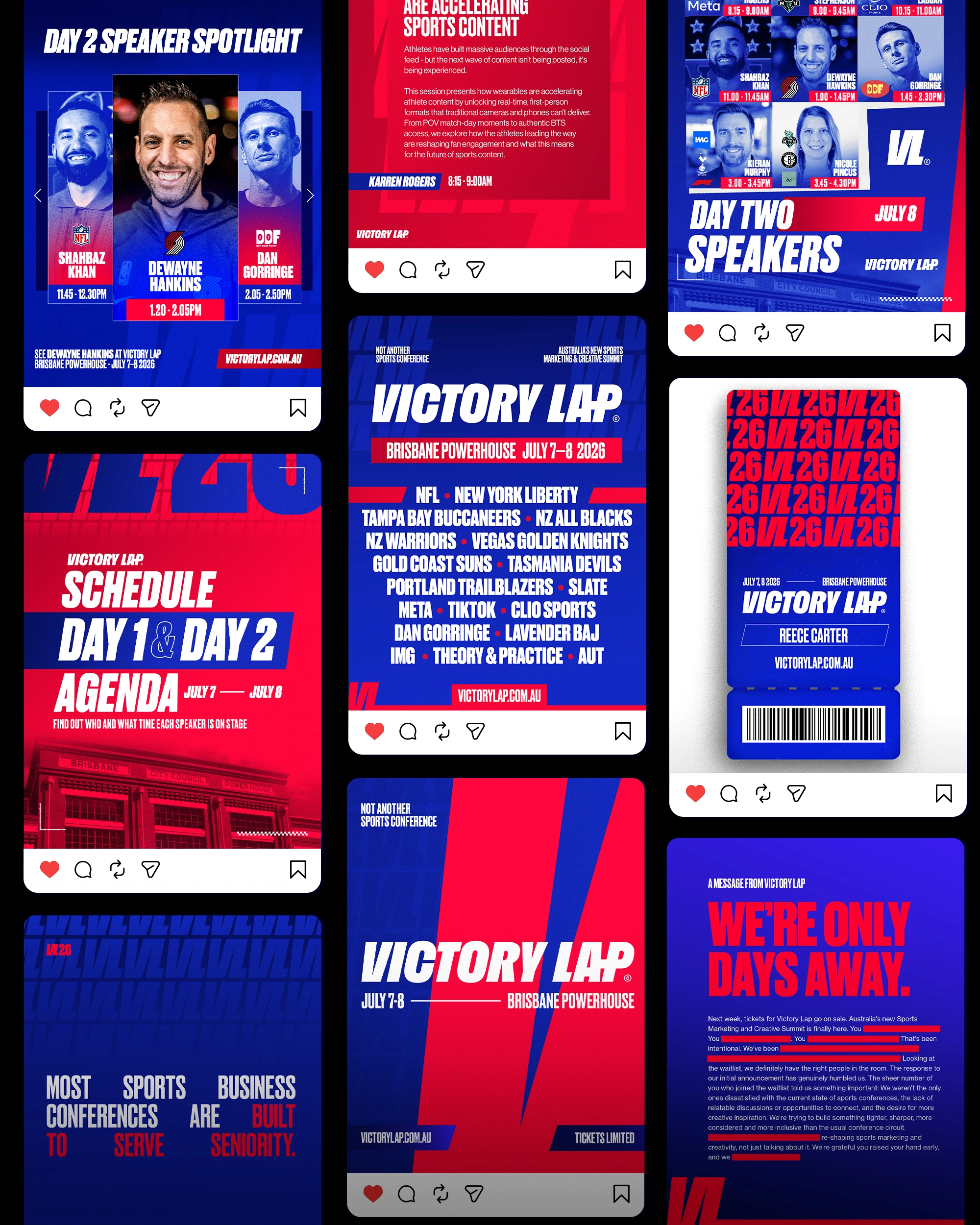
We built the identity around a bold, condensed wordmark that gave Victory Lap a strong and recognisable foundation, then created a broader visual system that could constantly change around it.
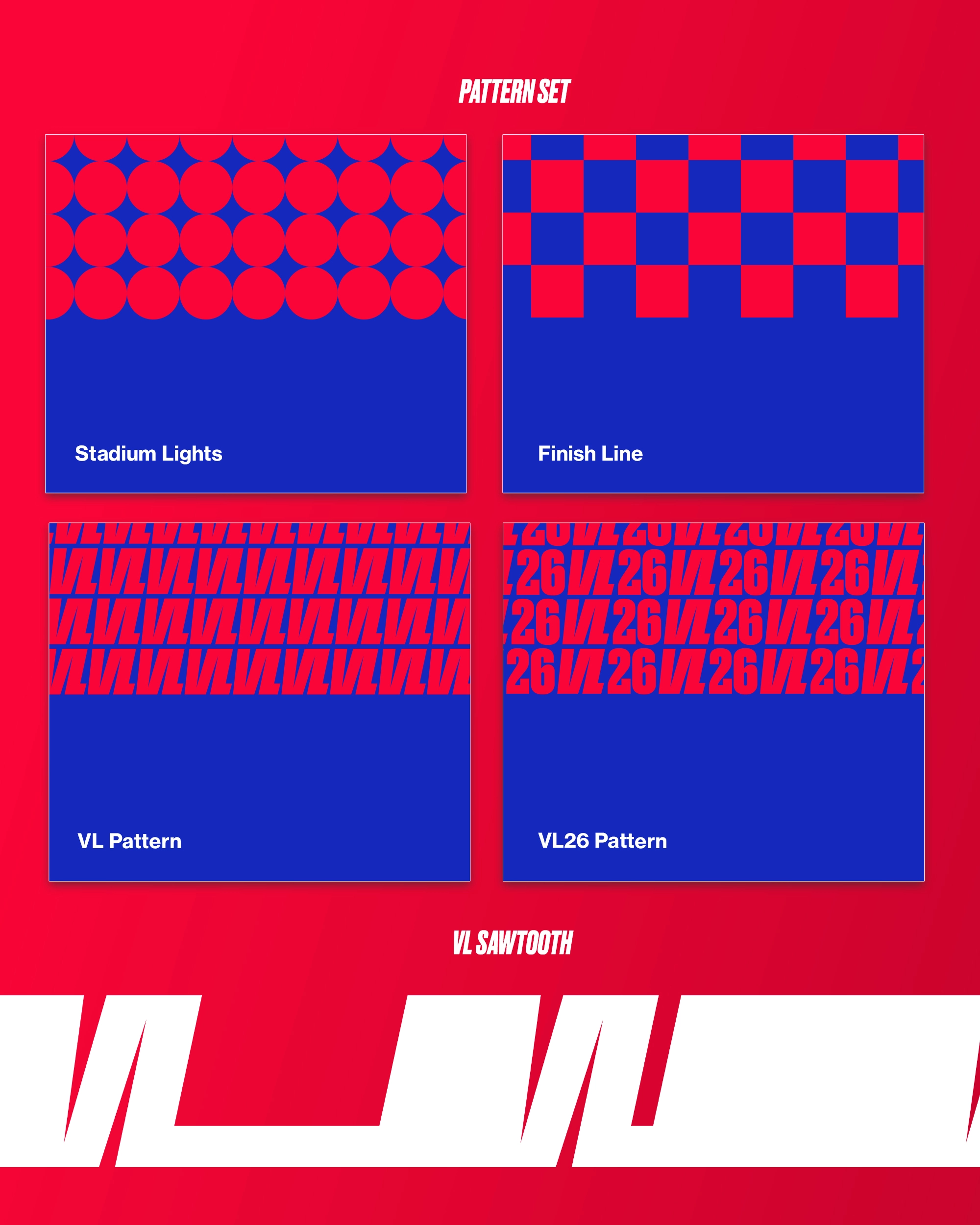
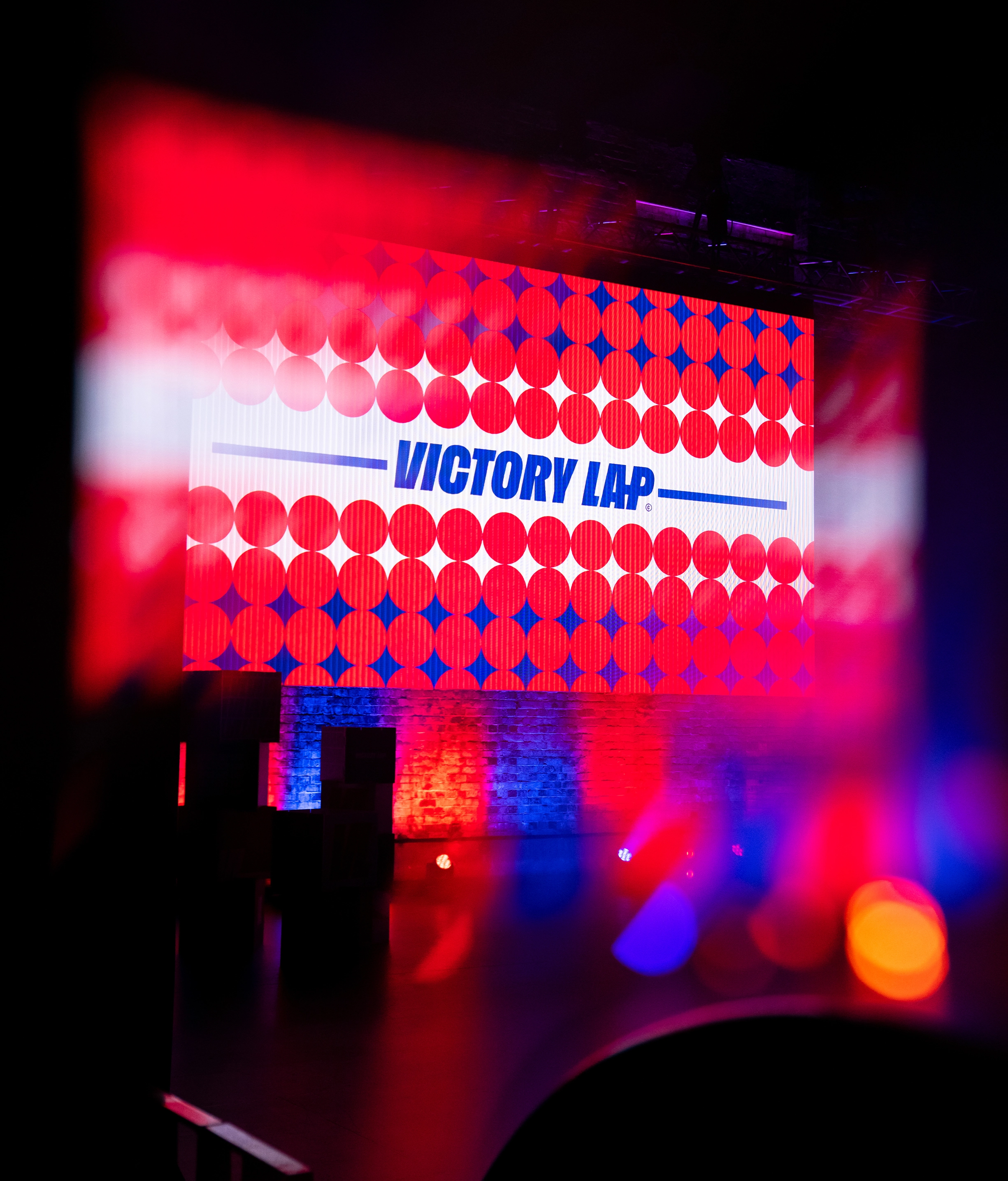
A bright colour palette, bold typography, gritty textures, photography and a mix of graphic elements gave us plenty of ways to dial the identity up or down depending on the application. The approach was intentionally a little raw, playful and energetic rather than overly polished or corporate - reflecting the type of event Victory Lap was trying to be.
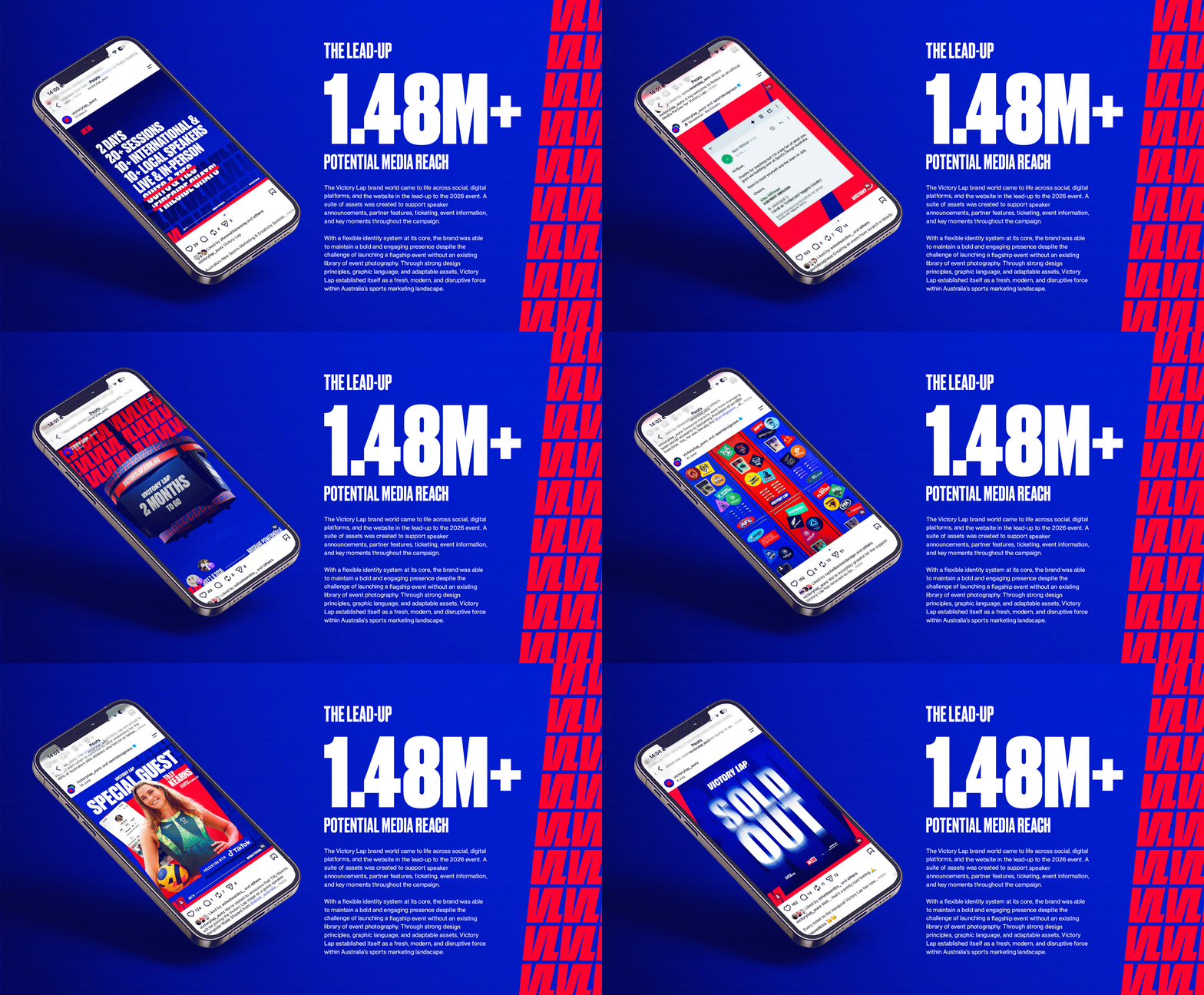
Just as importantly, we designed the identity with the full event journey in mind. The same brand people first encountered through launch campaigns, speaker announcements and social content needed to feel just as natural once they walked through the doors.
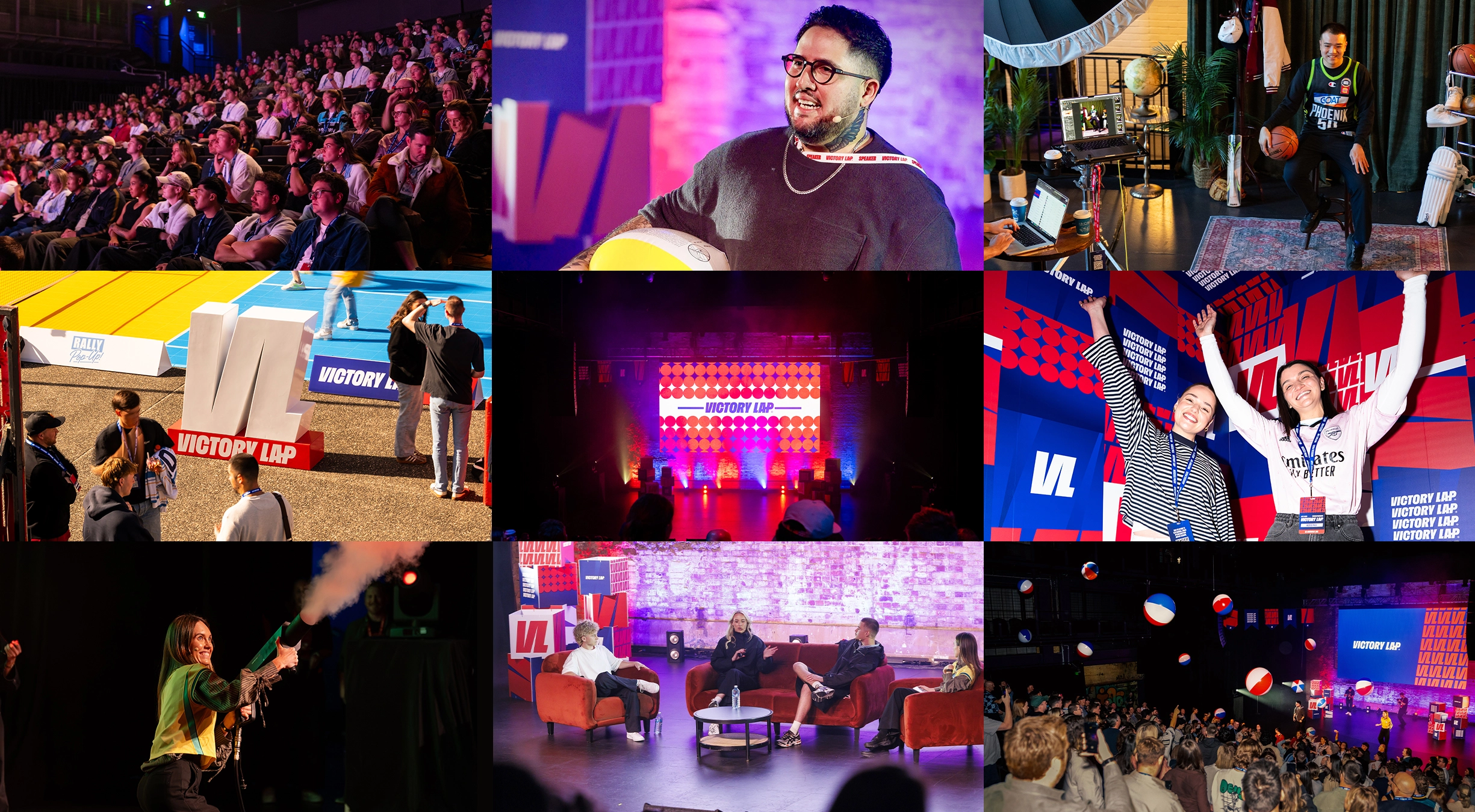
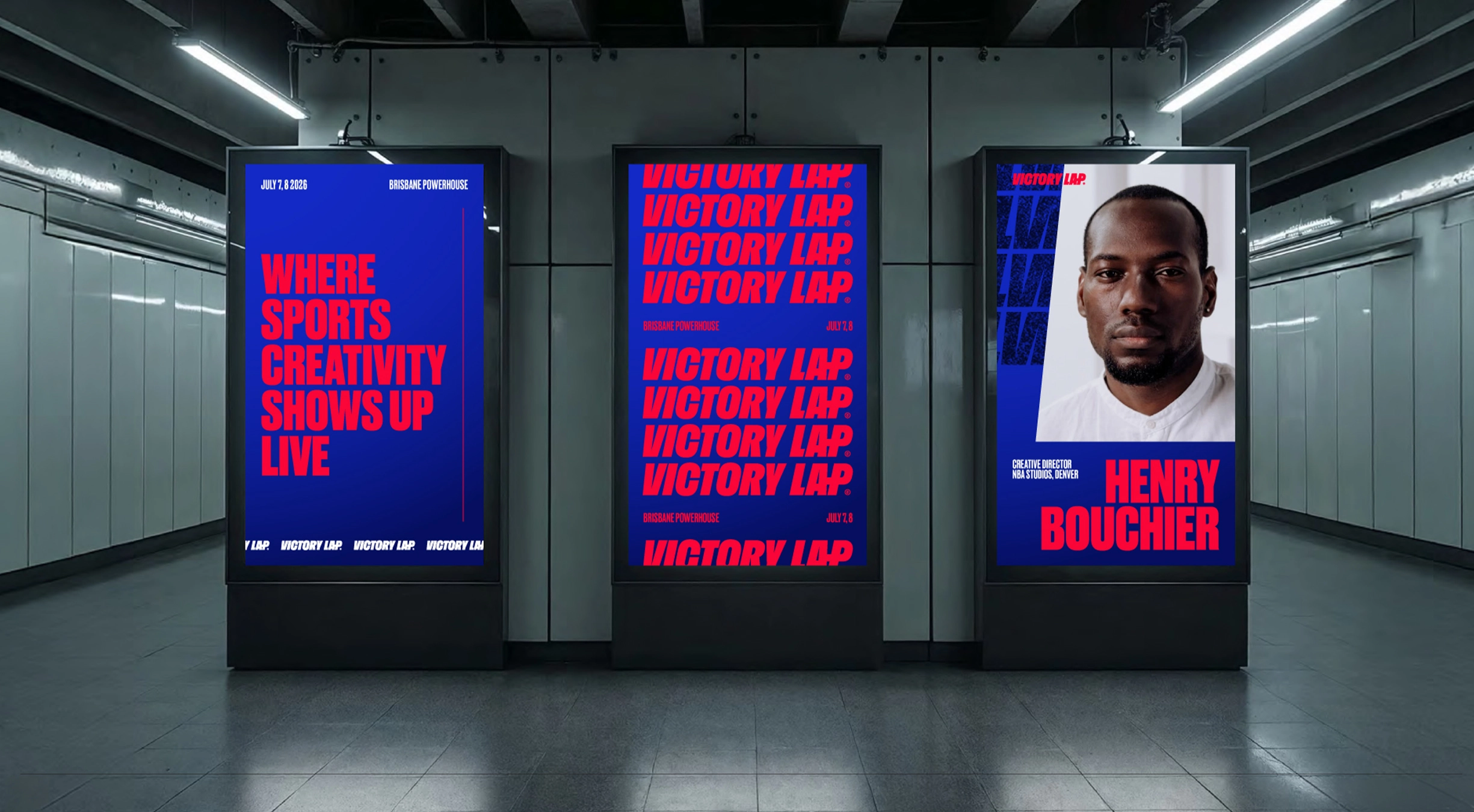
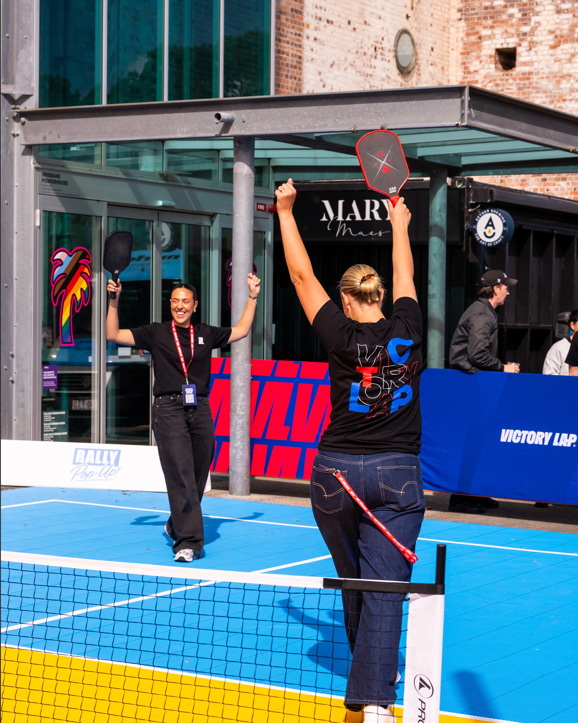
Across the two days, the identity came to life through the stage, screens, signage, merchandise, credentials and partner activations, right down to smaller details throughout the venue.
The idea was pretty simple: wherever you encountered Victory Lap, online or in person, it should feel like part of the same world.
Outcome:
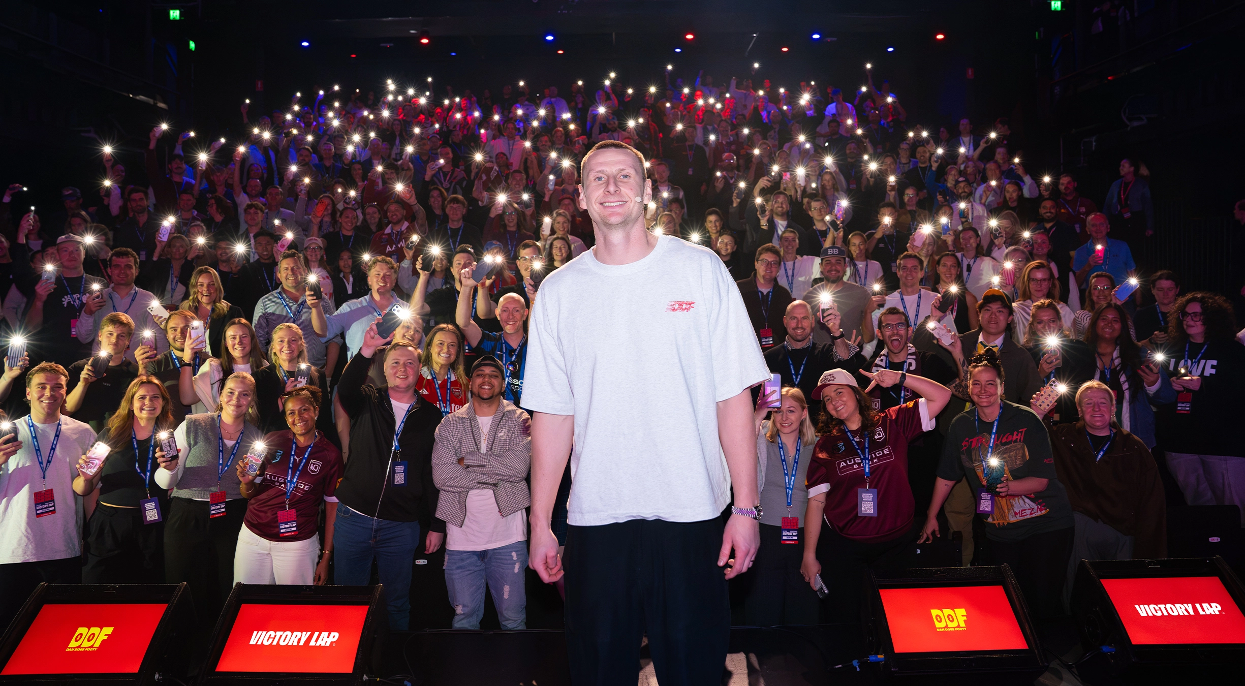
Victory Lap sold out in its first year, bringing 350 people from across the sports industry together in Brisbane for two days.
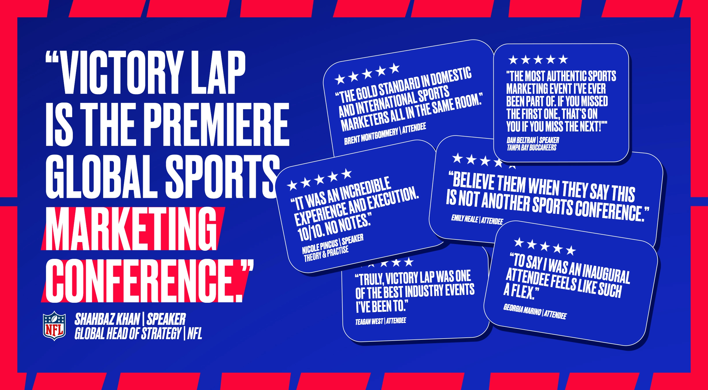
The response afterwards probably said it best. One speaker described it as “sports marketing Coachella”, while attendees called it “one of the best industry events I’ve been to” and said it “exceeded every expectation.” Another summed up the original idea perfectly: “Believe them when they say they’re not just another sports conference.”
For a completely new event, the identity quickly gave Victory Lap a look and personality people could recognise and connect with. More importantly, it helped turn the brand into part of the experience itself - from the first announcement someone saw online through to what they saw, wore and interacted with across the two days.
It also gave Victory Lap a flexible brand system and a strong foundation to keep building on as the event grows. Watch out 2027...
%20copy.webp)