Overview:
Oceania Rugby represents rugby across one of the world's most diverse regions, bringing together unions and communities throughout the Pacific.
We partnered with the organisation to develop a refreshed visual identity and design system that better reflected the character of the region, while giving its team a more consistent and practical way to communicate across marketing, commercial and corporate channels.
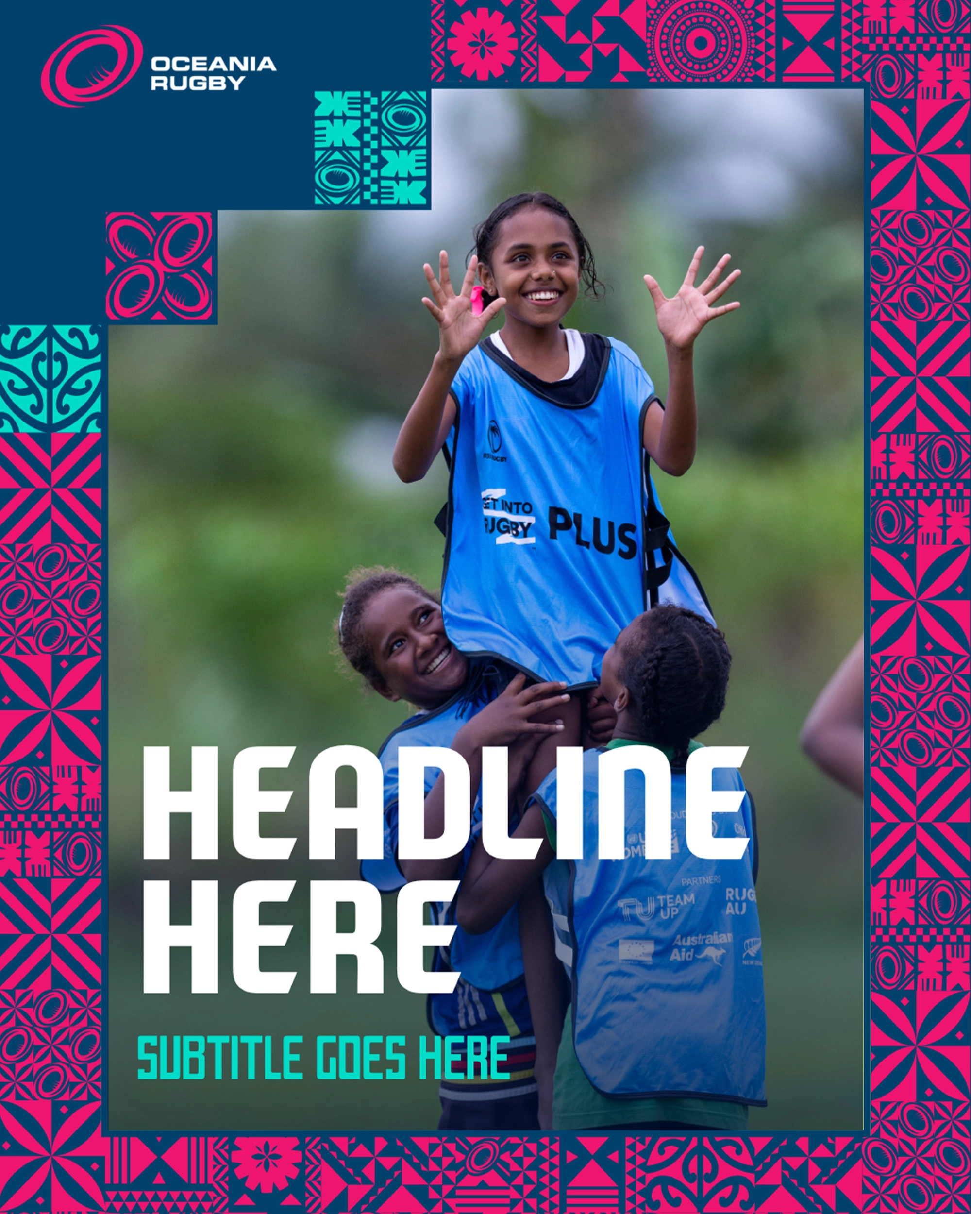
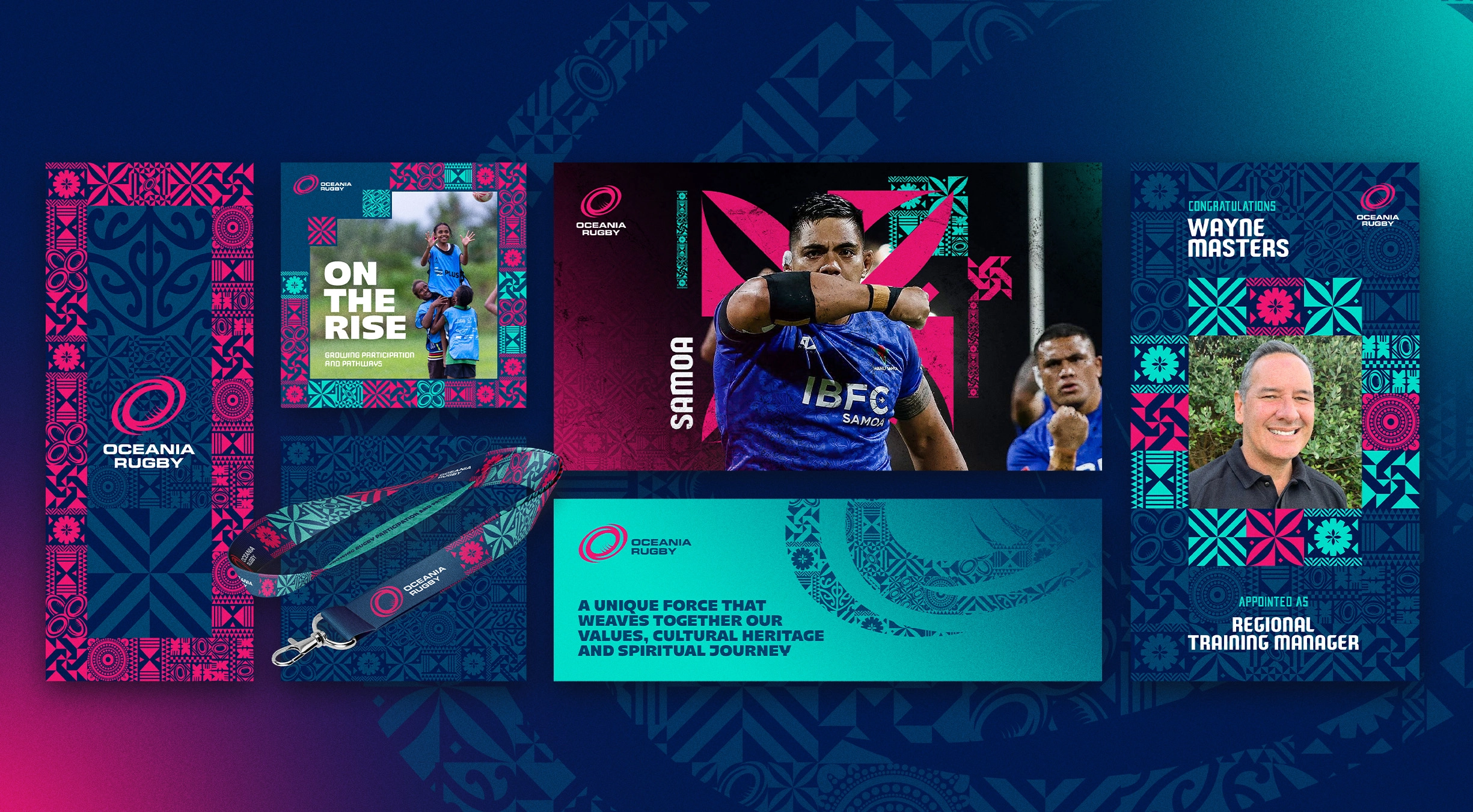
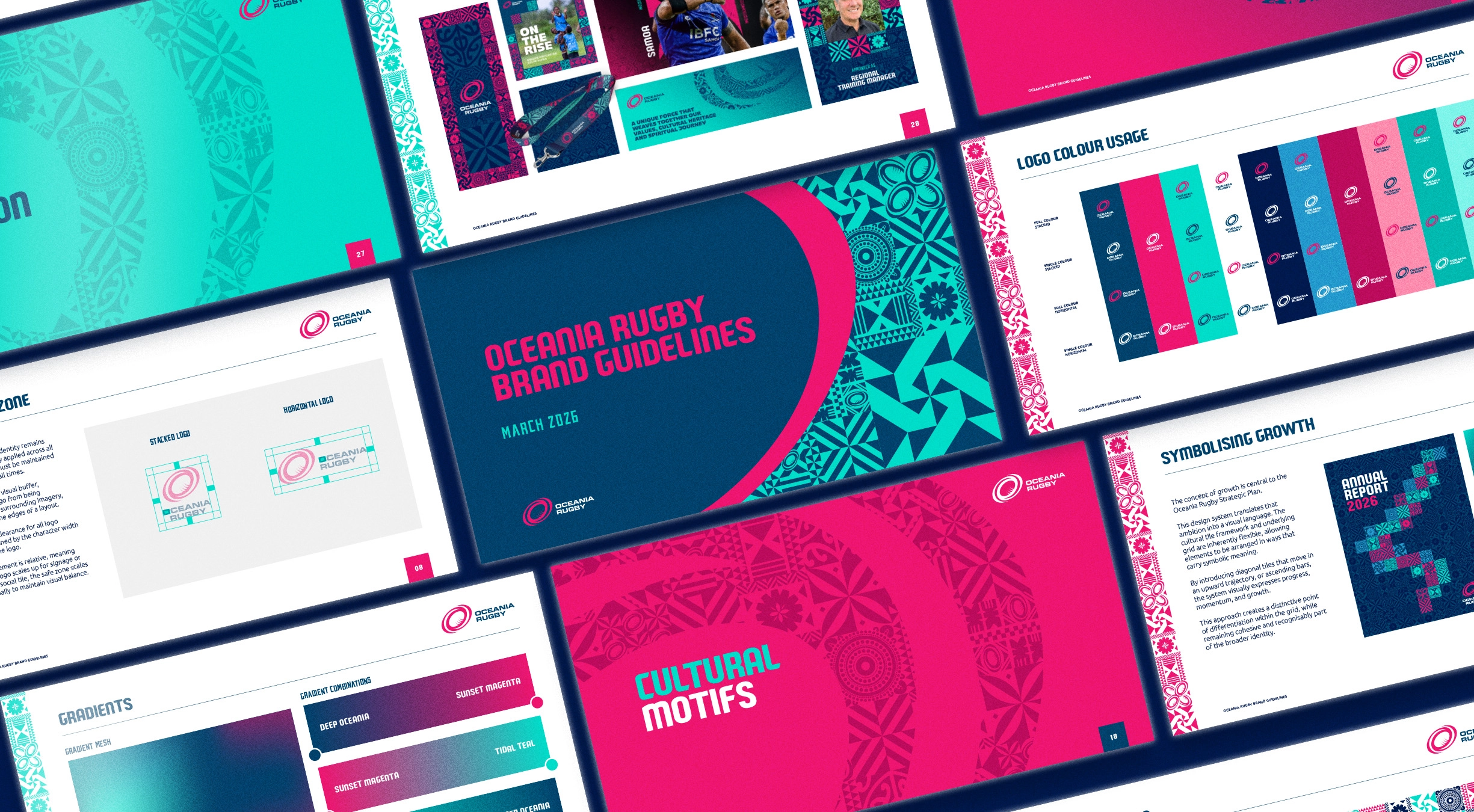
The project included a new colour and typography system, key art, graphic devices, templates and a corporate presentation deck - all designed to work together as one flexible identity.
Challenge:
Oceania Rugby needed an identity that could represent a diverse region without trying to reduce it to one visual idea.
There was already cultural artwork within the brand that carried meaning and recognition, so rather than replacing it, we needed to find a way to give it more flexibility and make it easier to use across a much broader range of creative.
There was also a very practical side to the brief.
The same identity needed to work across everything from campaign creative and social content to presentations, annual reports, commercial documents and everyday communications.
The challenge was finding the balance between something expressive enough to feel distinctly Oceania Rugby, and structured enough for the organisation to use consistently day to day.


Solution:
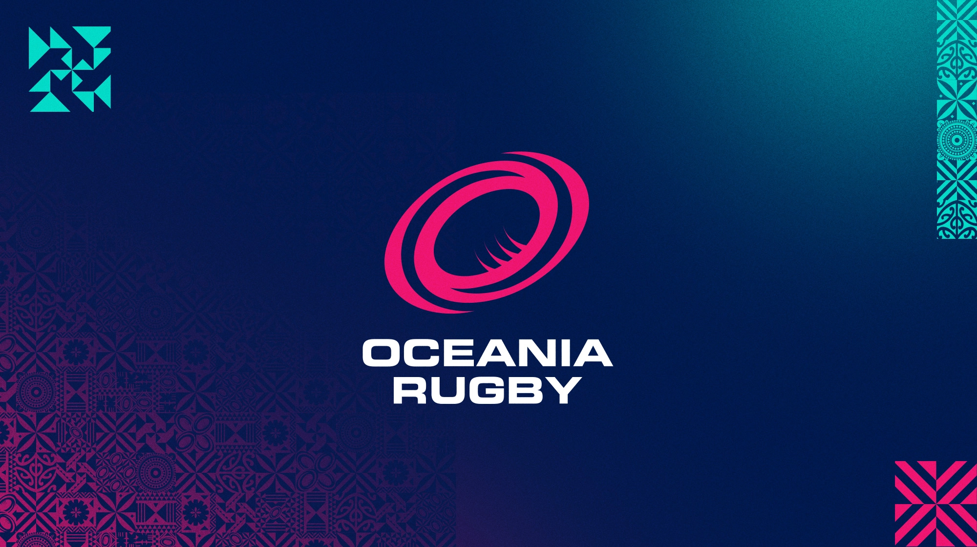
We built the new identity around the colours, landscapes and existing cultural artwork of Oceania, giving the organisation a broader visual language without losing its connection to the region.
The refreshed colour palette draws inspiration from the Pacific Ocean, tropical coastlines and island sunsets, creating a much wider range of combinations that could shift depending on the application.
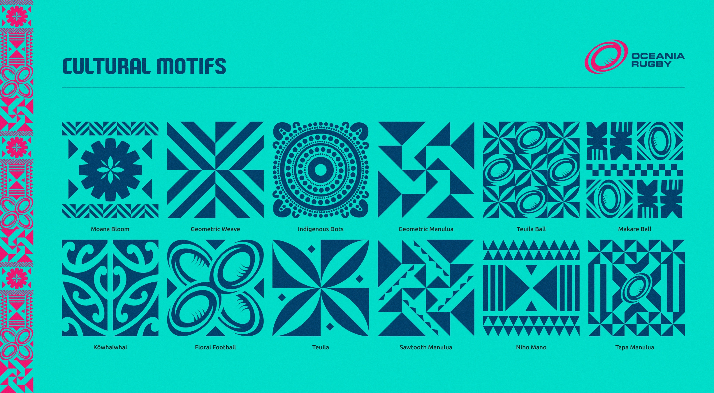
Rather than treating the existing cultural artwork as one fixed graphic, we broke it down into a modular tile system. Individual elements could be repositioned, cropped, repeated and combined to create everything from bold hero graphics to patterns, frames, borders and subtle background details.
This became the foundation of a much more flexible design system.
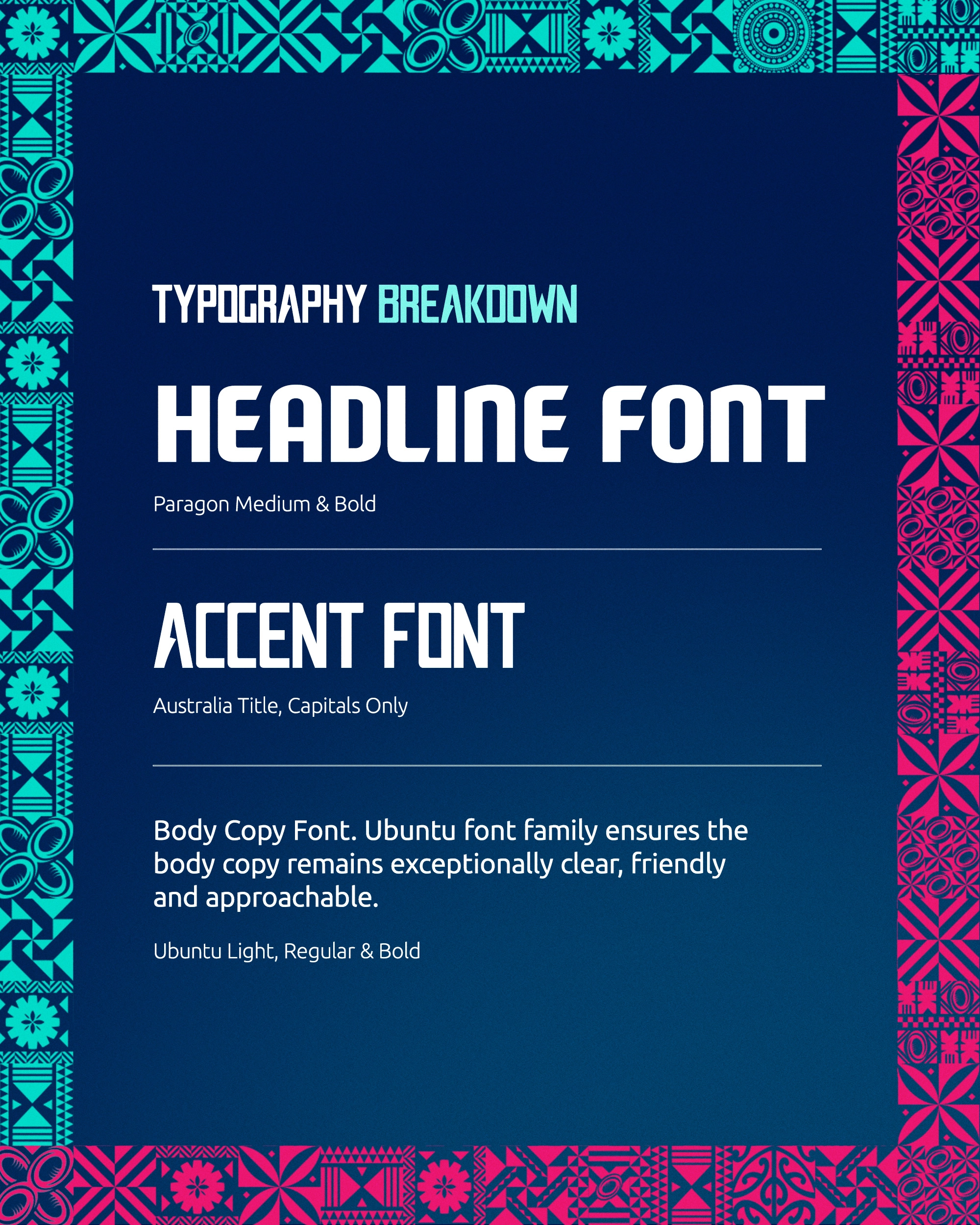
Supporting graphic devices and a refined typography system added structure and hierarchy, while templates and presentation layouts showed how the identity could work across both expressive marketing creative and more functional corporate communications.
The result was a toolkit with enough personality to represent Oceania Rugby, but enough flexibility to keep creating without having to reinvent the look every time.
Outcome:
The refreshed identity gave Oceania Rugby one consistent creative system that could work across very different parts of the organisation.
From social and campaign creative through to event branding, presentations and commercial documents, teams now had a shared visual language that could be adapted depending on what they needed to communicate.
Most importantly, the modular approach gave the existing cultural artwork a much bigger role within the brand. Rather than being limited to one fixed application, it became a flexible library of graphic ingredients that could continually be rearranged and reinterpreted while still feeling recognisably Oceania Rugby.
The result was an identity designed not just to look good in a brand presentation, but to be practical, flexible and useful across the organisation day to day.