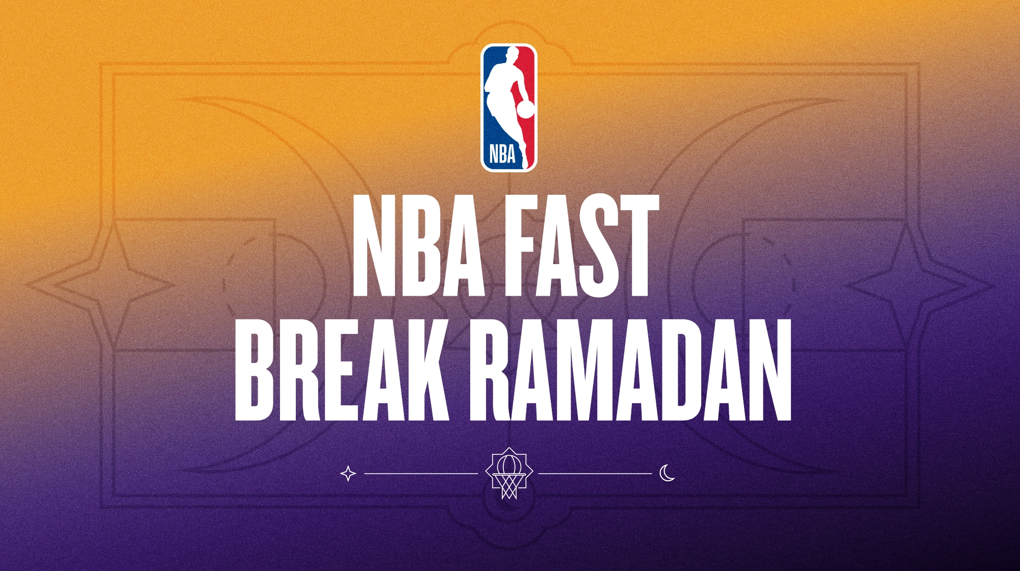
Overview:
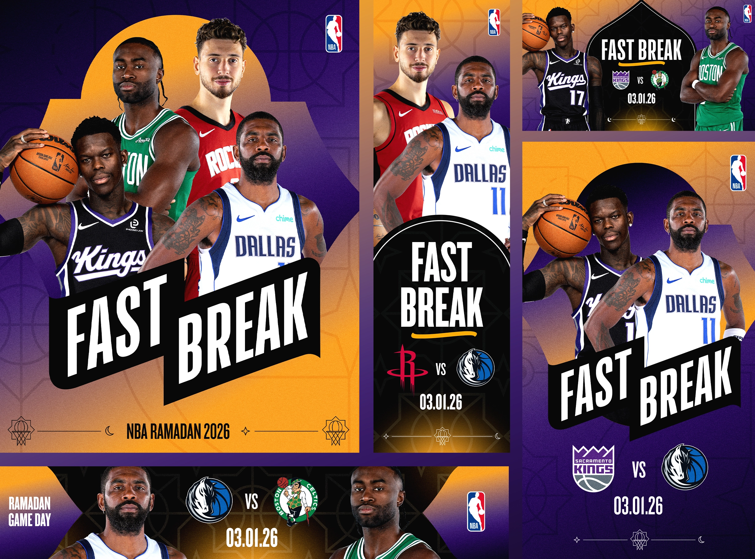
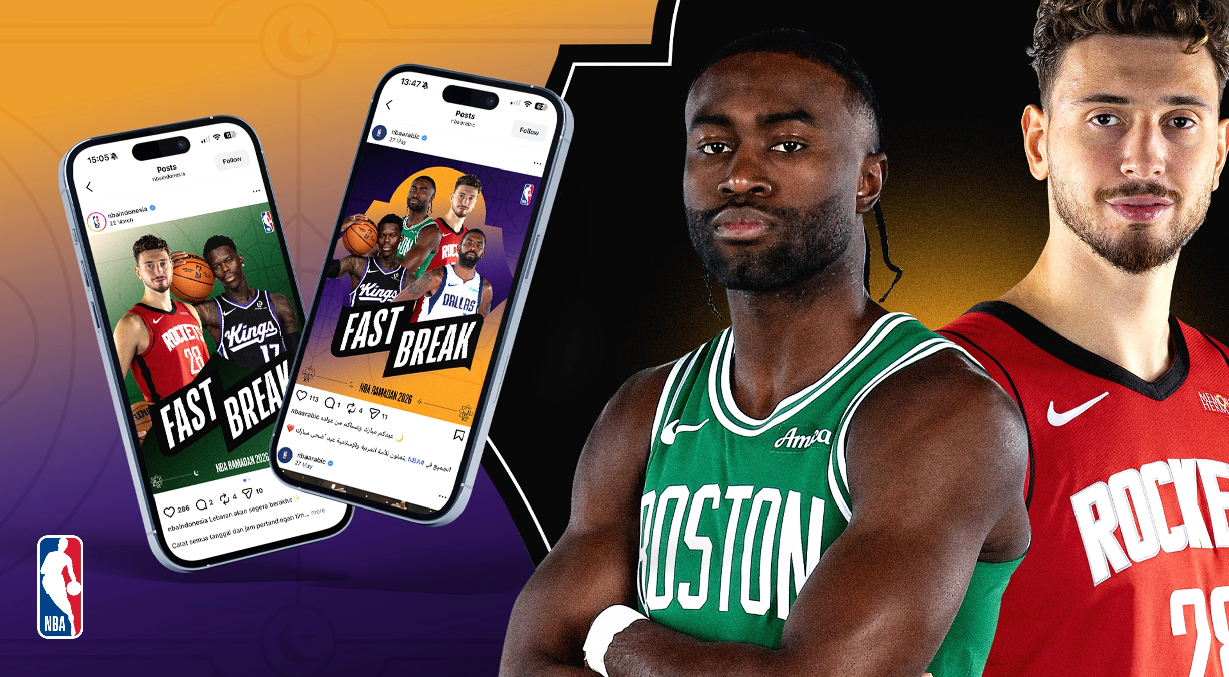
NBA Fast Break already had an established visual identity for its annual Ramadan campaign. Our role wasn't to start again, but to build on what was already working and give the brand more room to evolve.
Sport Design Australia was tasked with refreshing the identity through an expanded colour palette, new graphic elements and devices, additional layout approaches and an updated style guide.
The goal was to create a more flexible system for the NBA team to work with throughout Ramadan, while keeping the campaign recognisable and connected to what had come before.
Challenge:
The existing identity had already built recognition, so completely reinventing it would have meant losing some of that familiarity.
Instead, the challenge was working out what should stay, what could evolve and where we could introduce something new.
The NBA team also needed more flexibility. With a wide range of content being created throughout Ramadan, the existing system needed more ways to adapt across different players, stories, formats and messages without every piece of creative starting to feel the same.
At the same time, any new visual language needed to feel culturally considered, authentic to Ramadan and naturally connected to basketball, while still sitting comfortably within the NBA's global brand.
Solution:
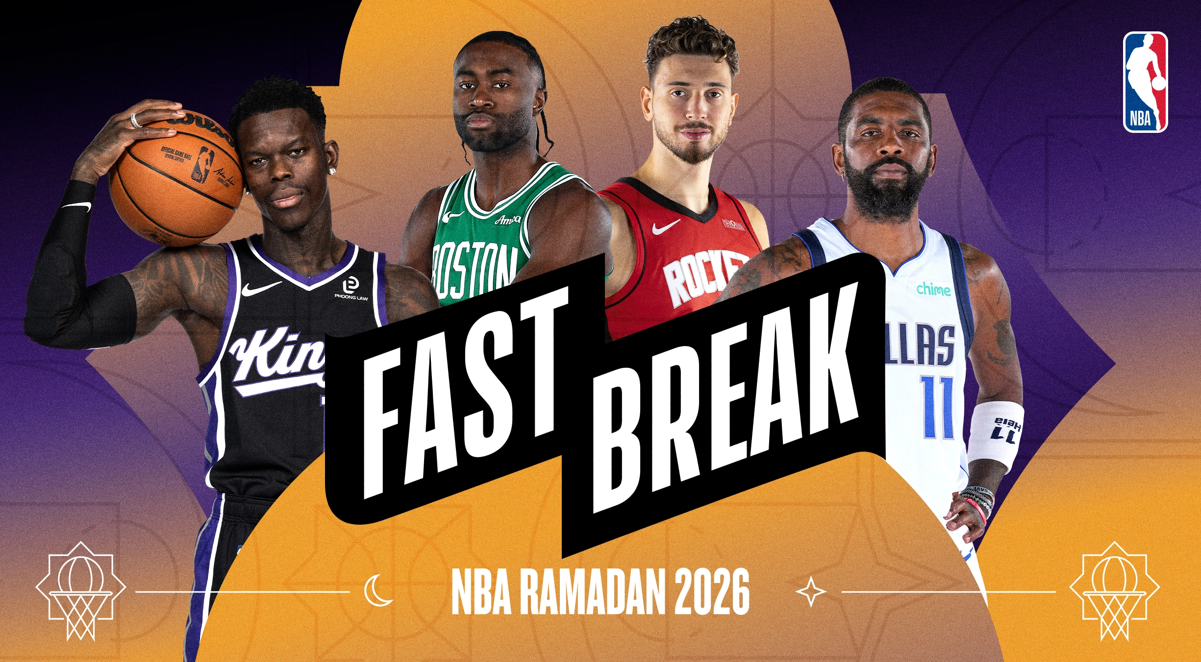
We started by identifying ways the visual languages of Ramadan and basketball could naturally come together, rather than treating them as two separate layers.
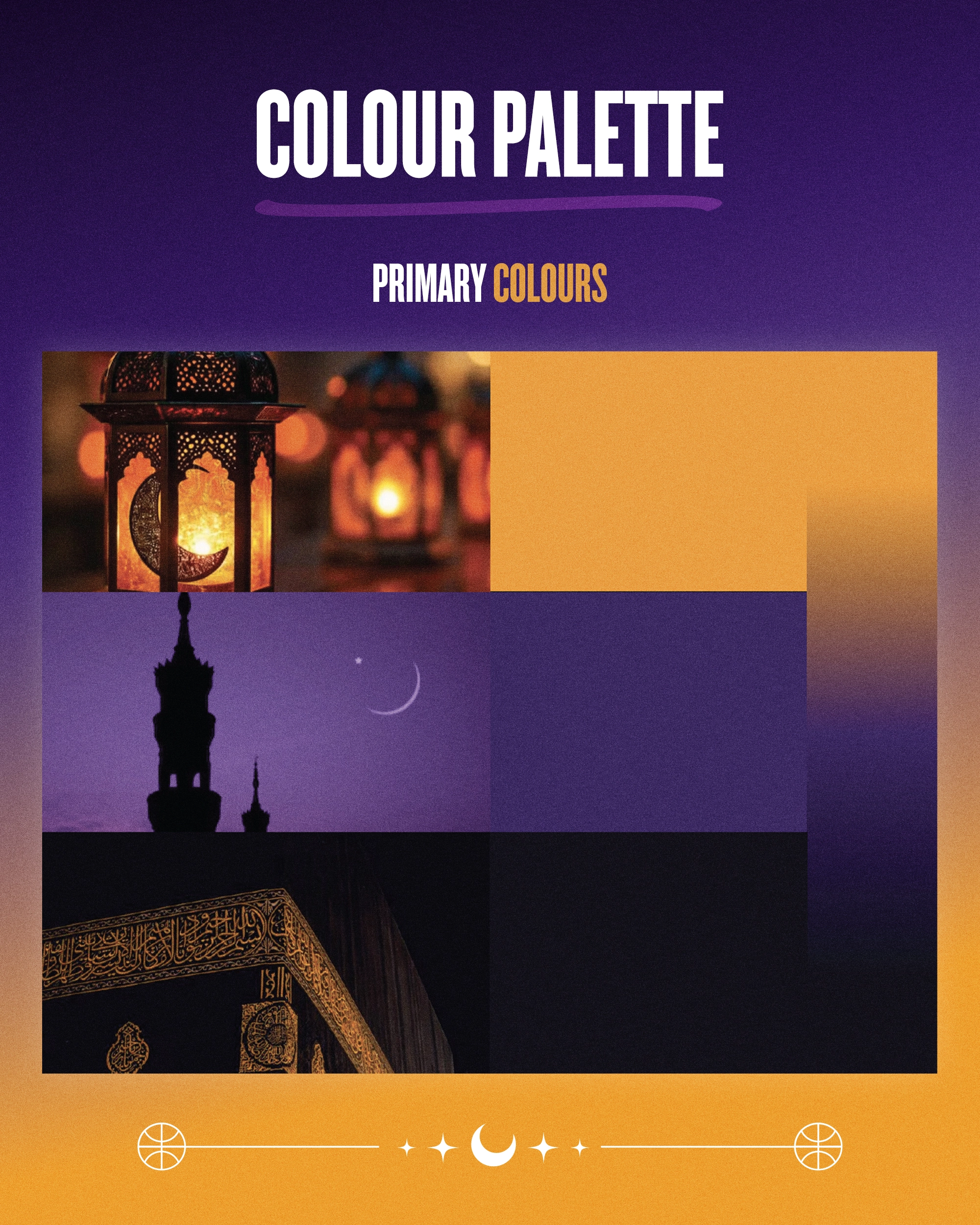
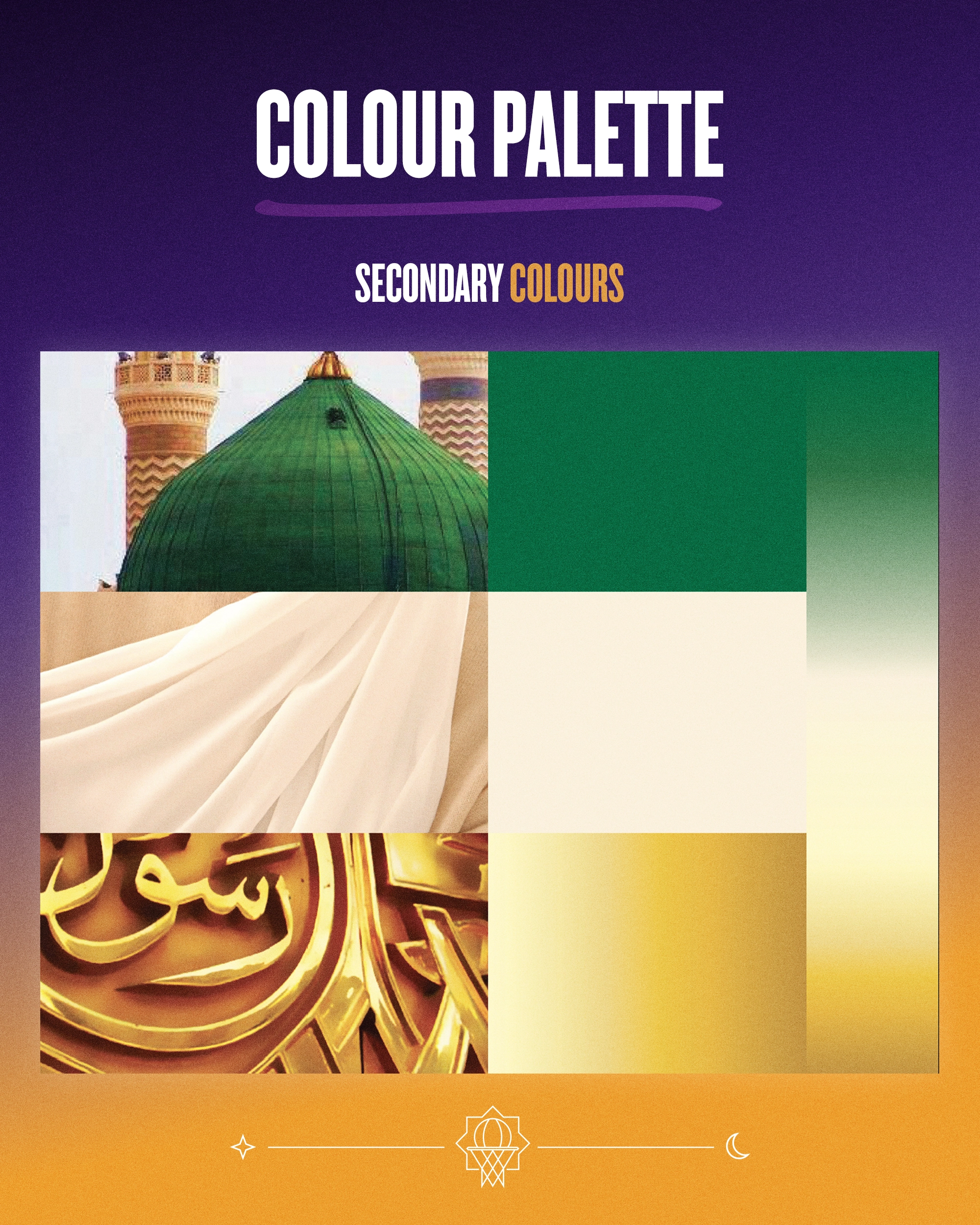
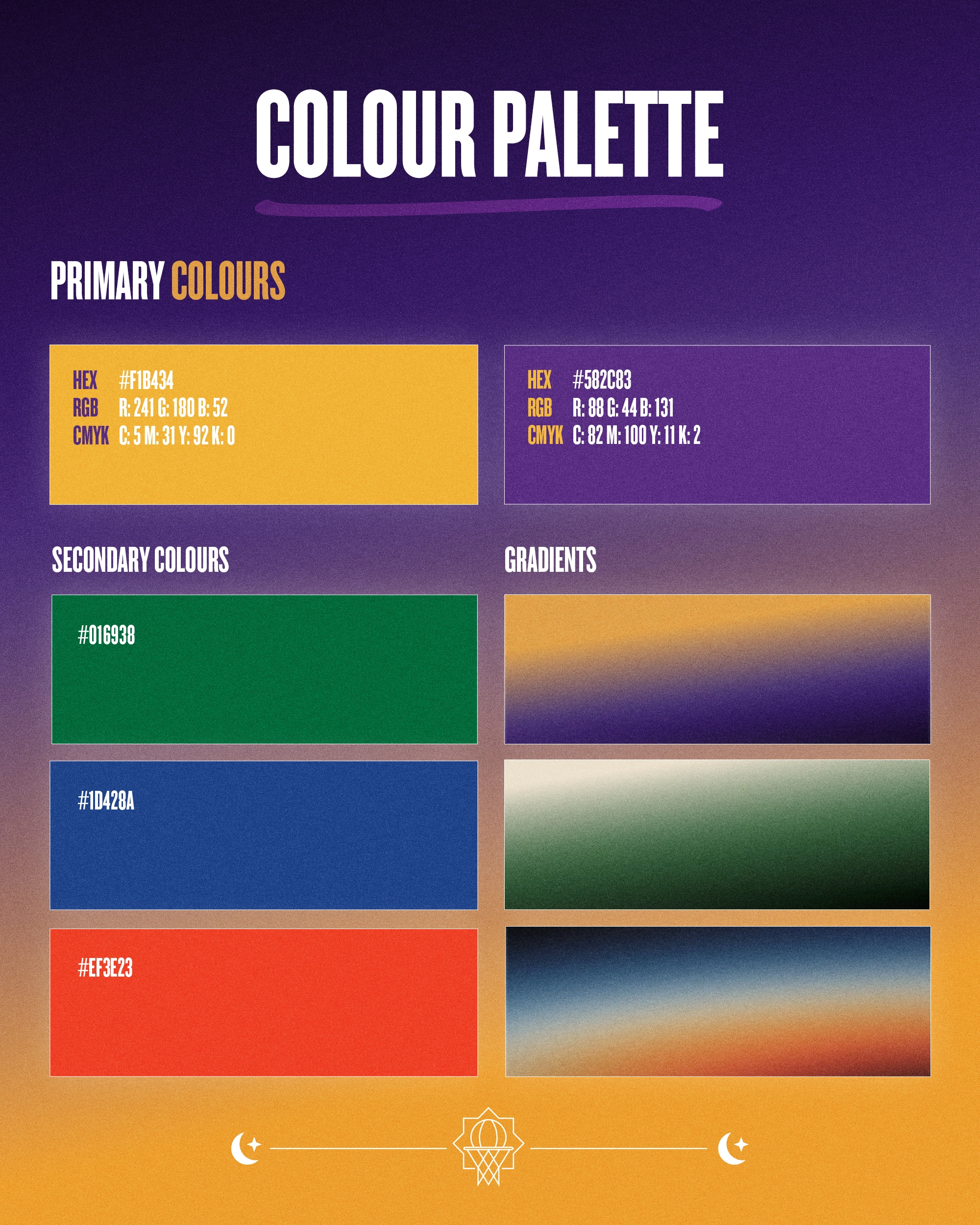
The expanded colour palette centred around rich purple and warm gold, drawing from twilight, the breaking of the daily fast and the light associated with Ramadan. Black, green and ivory provided supporting colours connected to spirituality, faith, purity and heritage.
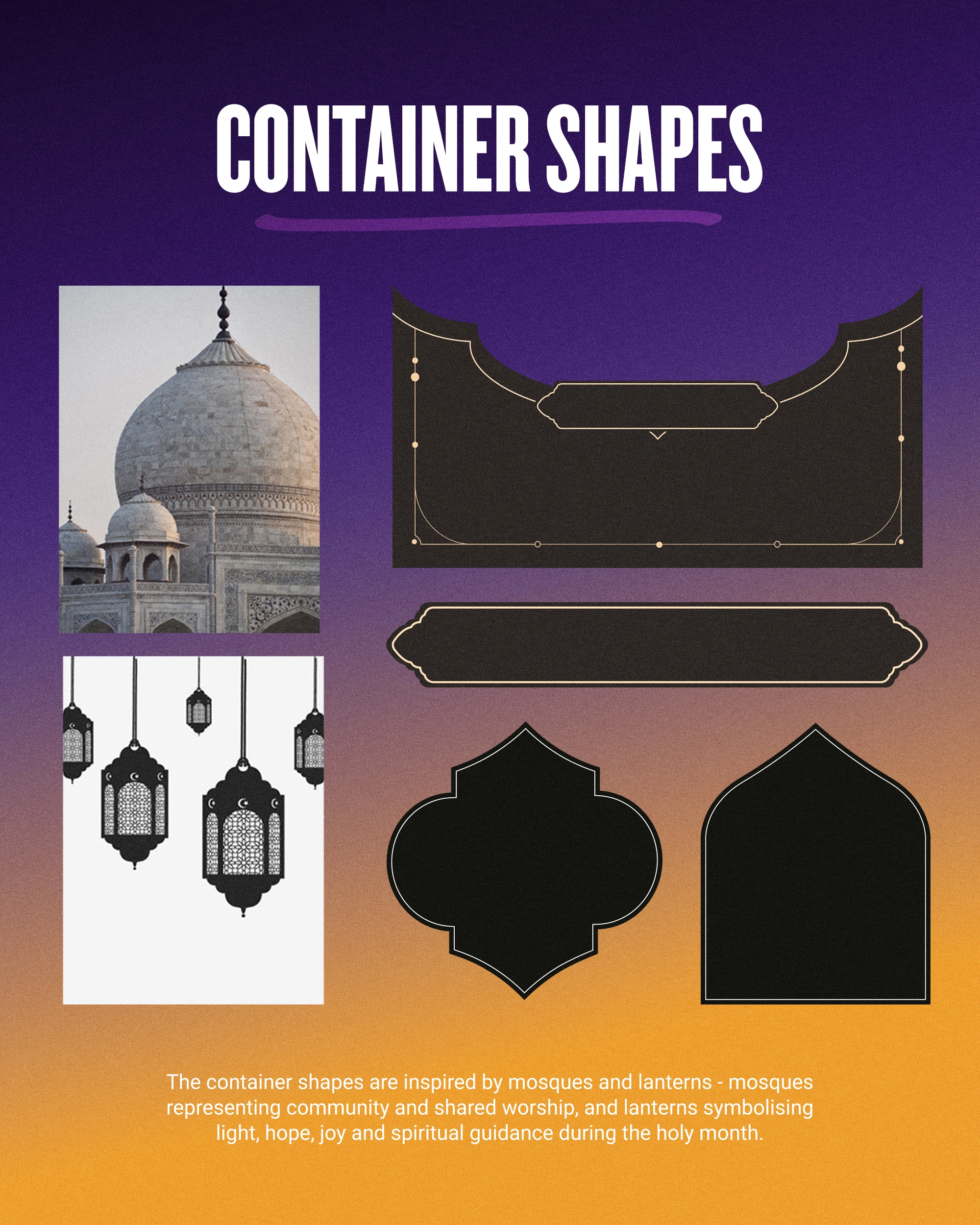
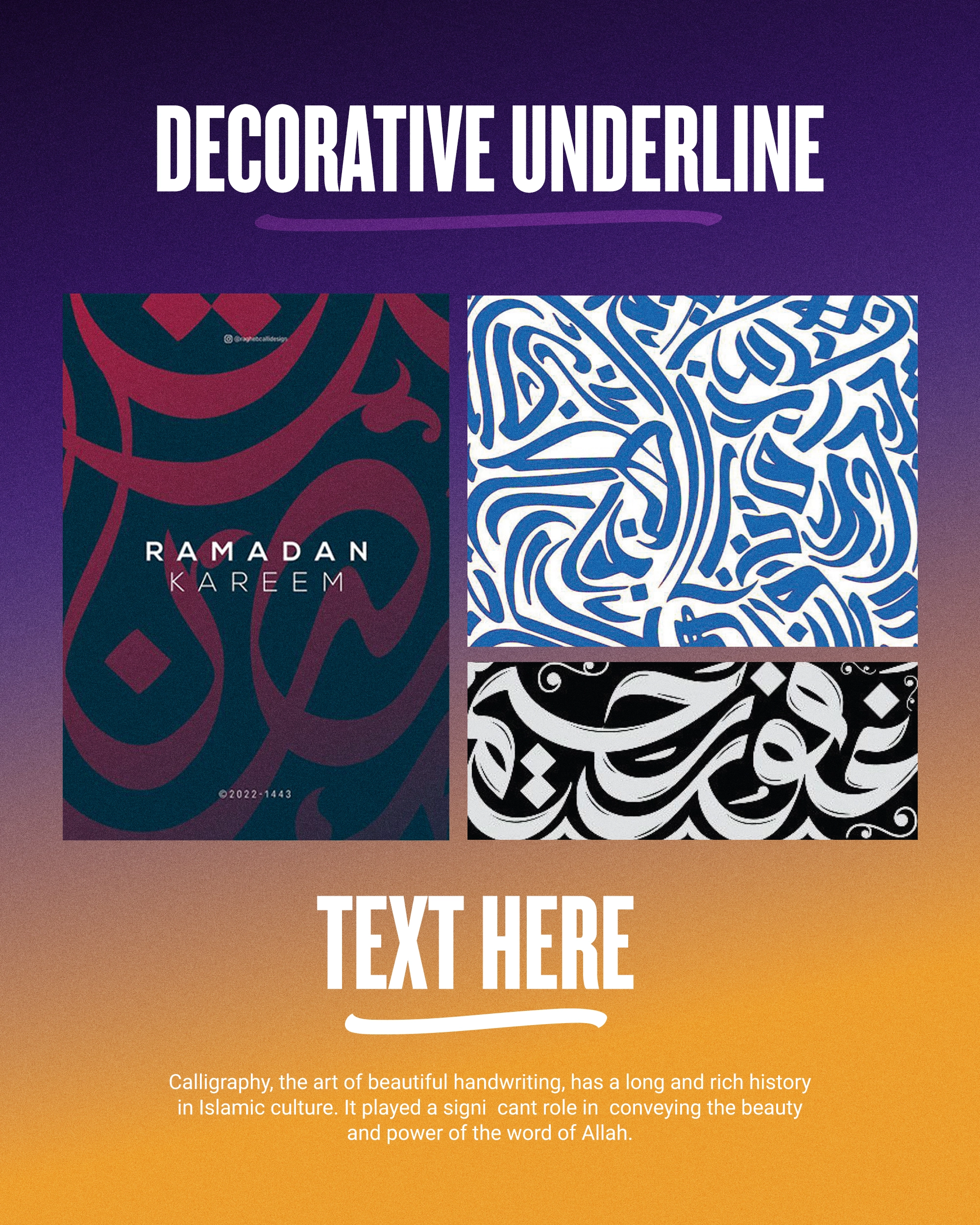
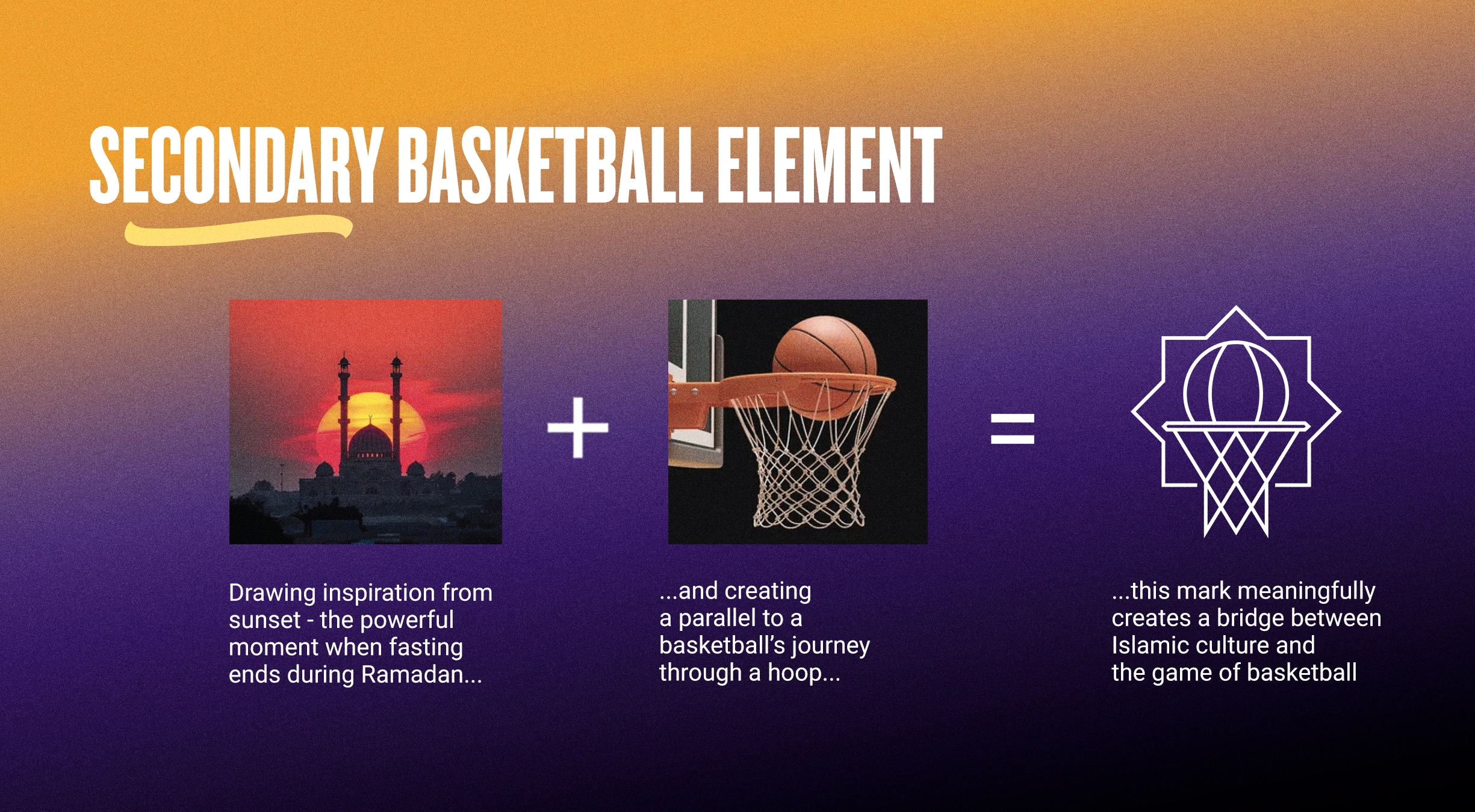
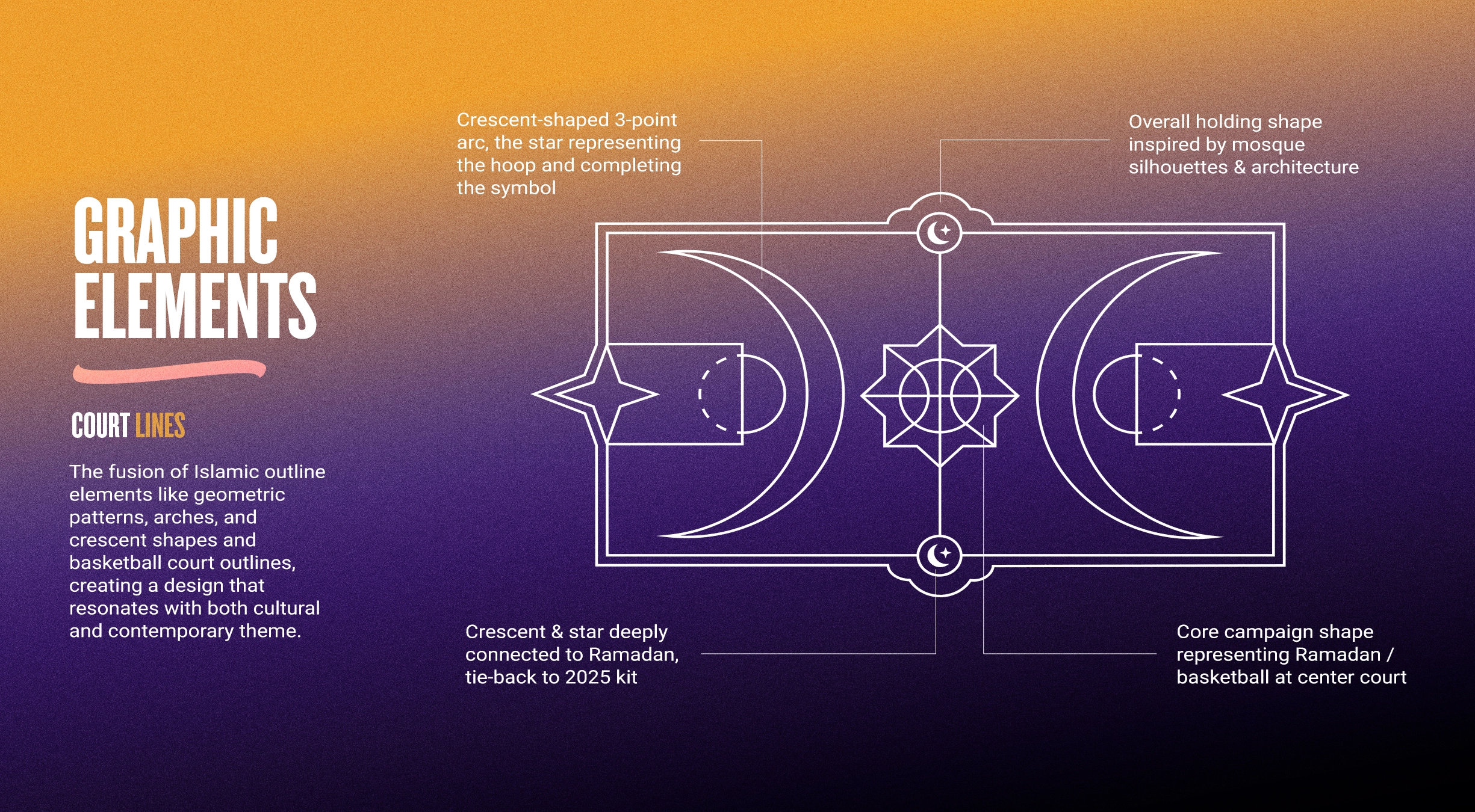
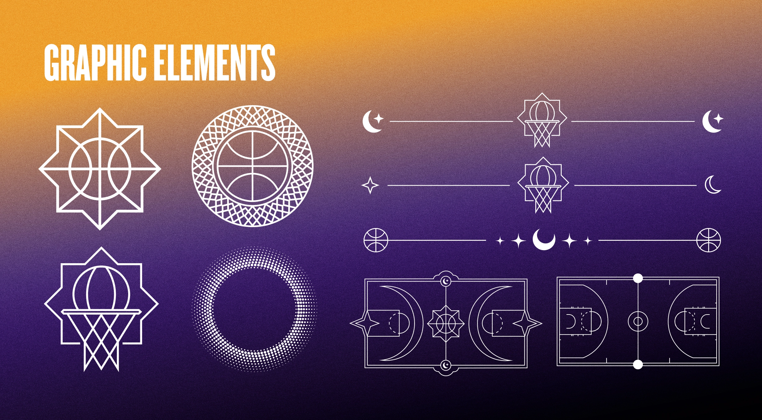
From there, we developed a suite of bespoke graphic devices that combined references from Islamic architecture, geometric patterns and symbolism with familiar elements from basketball.
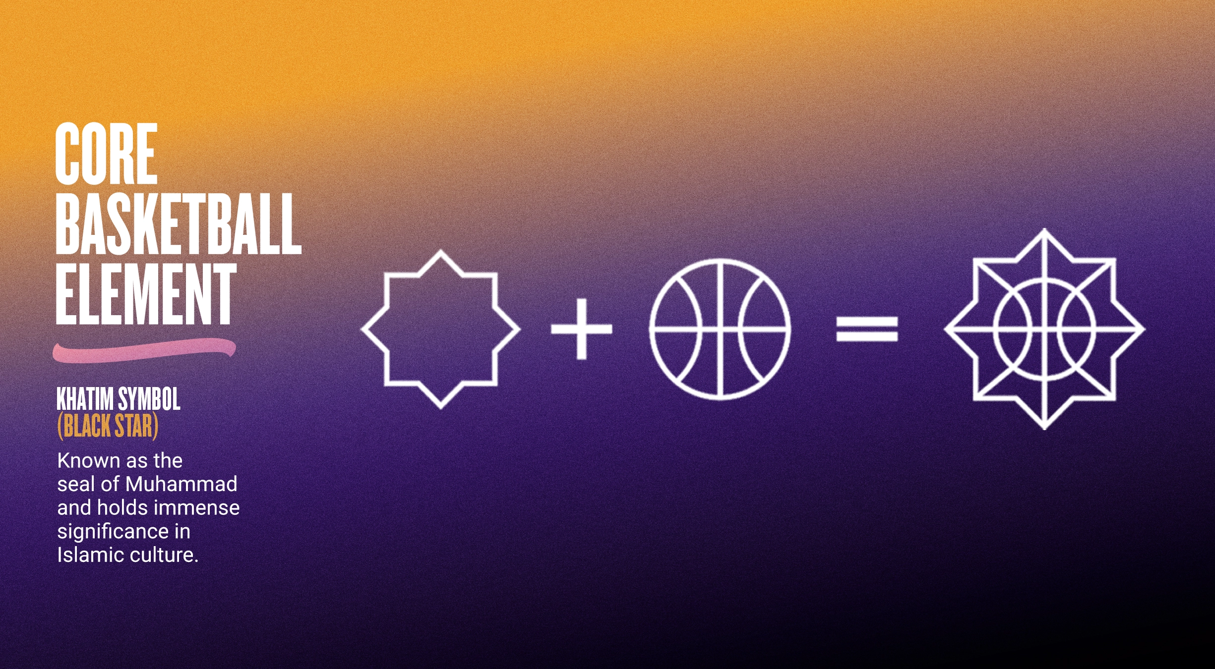
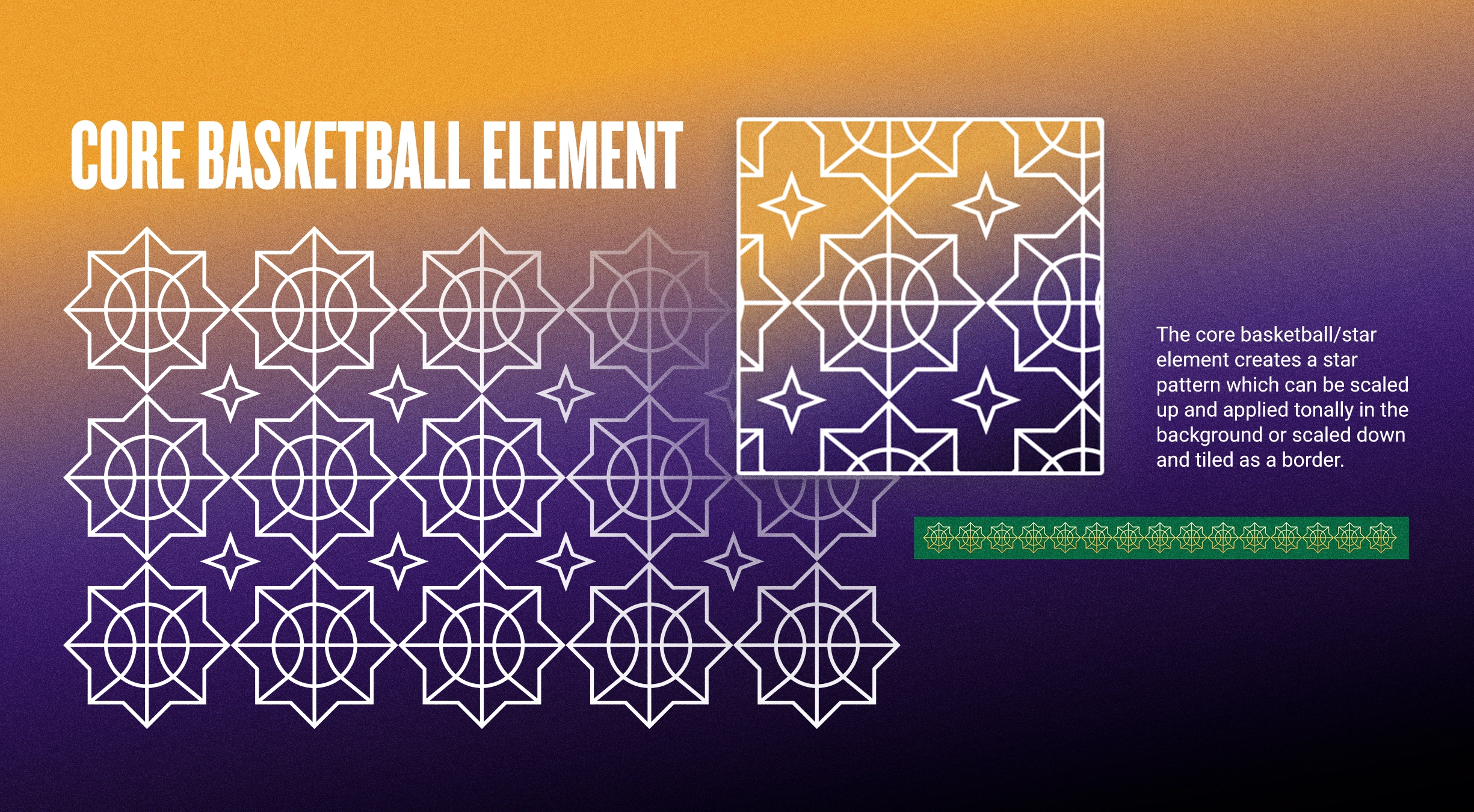
A core star graphic brought together the Khatim with the lines of a basketball, while secondary elements reinterpreted hoops, court markings, crescents and mosque silhouettes to create a broader visual language for the campaign.
Importantly, these weren't designed as decorative elements with one fixed use. They could become hero graphics, patterns, borders, framing devices or subtle background details depending on the content.
Combined with new layout approaches and an updated style guide, this gave the NBA team more ways to create while keeping everything recognisably part of the same Ramadan identity.
Outcome:
The refreshed identity gave NBA Fast Break a much broader creative toolkit without losing the recognition the campaign had already built.
Rather than replacing the existing brand, we gave the NBA team more ways to work with it - creating greater variety across content while maintaining a consistent look and feel throughout Ramadan.
The expanded system also gave the campaign room to continue evolving in future years, providing a strong creative foundation that could adapt as the NBA's Ramadan content and activations grow.