Overview:
The St. George Illawarra Dragons are one of the most recognisable clubs in Australian sport, with more than a century of history, an iconic Red V and generations of passionate supporters.
Sport Design Australia partnered with the club on its most significant brand project in years - starting with strategy and positioning before developing an entirely new visual identity and creative system.
The goal wasn't to change what made the Dragons recognisable. It was to better define what the club stands for today, give it a clearer creative direction for the future and build a system capable of bringing that idea to life across every part of the organisation.
Challenge:
Before any design work began, we needed to understand the Dragons beyond what people see on the field.
Through stakeholder workshops, audience research, brand analysis and conversations across the club, we looked at its history, culture, supporters, regions, commercial needs and ambitions for the future.
One thing became clear: while the Dragons had enormous recognition and heritage, the brand had become heavily tied to its history and on-field performance. What was missing was a clear emotional position that could connect players, staff, members, partners and supporters around what the club stood for beyond wins and losses.
The challenge was to find that position without losing the history and recognition the club had spent generations building.
From there, we also needed to turn that thinking into something practical - a visual identity capable of working across everything from major campaigns and membership to social content, match day, stadium screens, commercial partnerships and everyday club communications.



Solution:
Working closely with the Dragons, we developed a new brand platform centred around A Fire Within.
The idea came from the people and places that built the club. St George was forged through fire, while the Illawarra was strengthened by steel. Both regions share a history of working-class communities built on hard work, resilience and pride.
A Fire Within brought those stories together around something bigger: the inner drive shared by players, staff, members and supporters. A belief that effort, determination and pride matter regardless of the result.
That idea became the foundation for the entire visual identity.
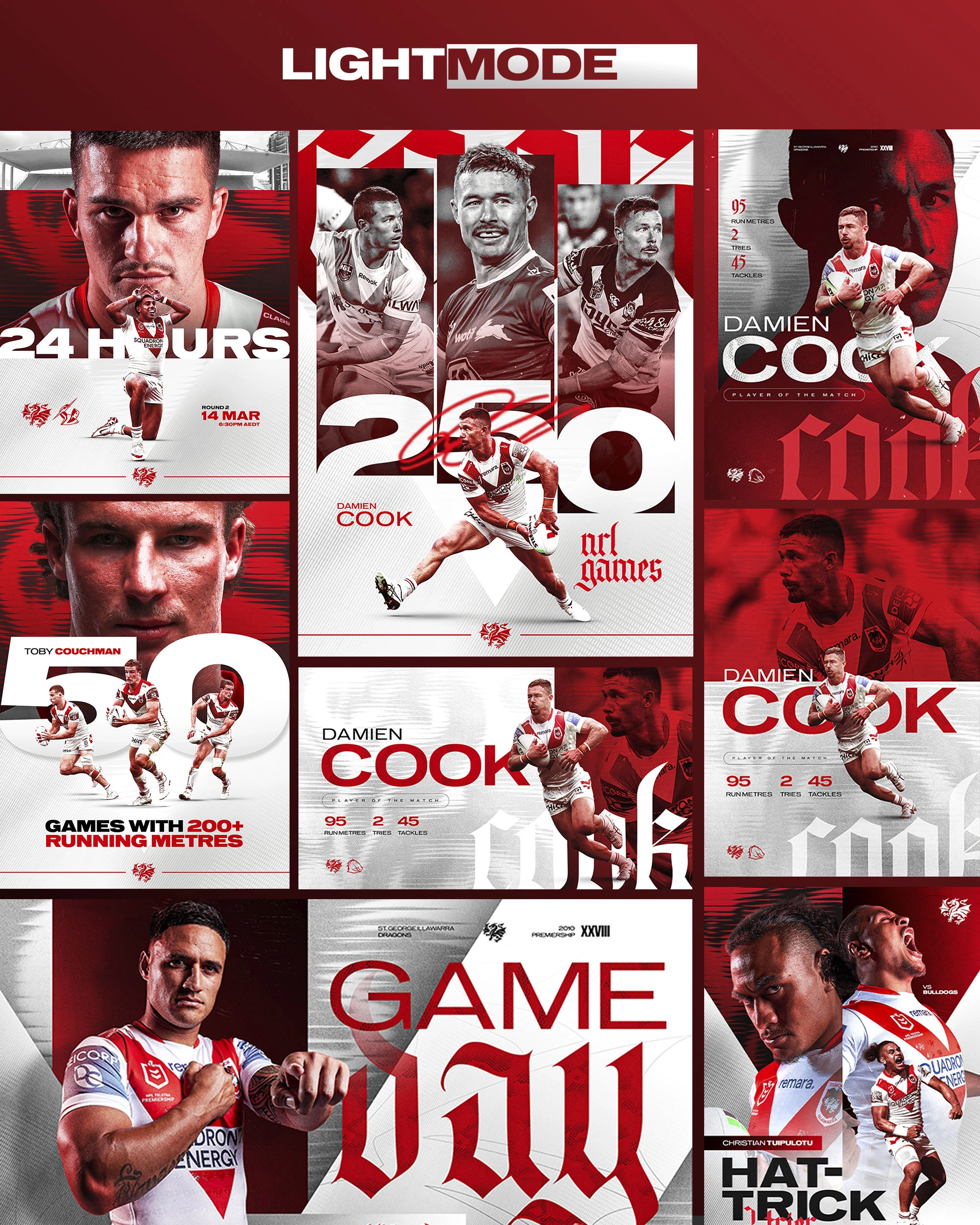
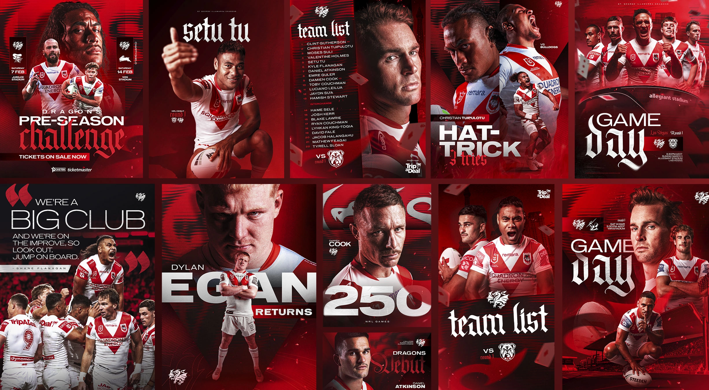
Rather than using literal flames, we built a visual language around the characteristics of fire and steel - heat, embers, distortion, texture and movement - allowing the idea to come through in different ways without overwhelming the club's existing identity.
The iconic Red V remained at the centre, supported by a new typography system, graphic devices, textures, photography direction, layouts and motion principles that gave the Dragons a much broader creative toolkit.
We then developed the system with real-world use in mind. It needed to work just as well on a major brand campaign as it did on a team list, membership ad, stadium screen or everyday social post.
The identity launched through the club's 2026 A Fire Within campaign before rolling out across social, match day, LED signage, big screens, photography, brand film, membership, marketing, digital and commercial creative.
A comprehensive set of guidelines and templates brought everything together, giving the club and its creative teams a clear system they could continue to use and evolve.
Outcome:
What began as a brand strategy project ultimately reshaped how the Dragons present themselves across almost every major touchpoint.
For the first time, the club had a clear positioning connecting its history, people and two regions with where it wanted to go next - supported by a visual identity designed to bring that idea to life consistently.
A Fire Within became more than a campaign line. It gave the Dragons a creative platform that could stretch from major storytelling moments through to the everyday content supporters see throughout a season.
Just as importantly, the project gave the club a system built for the long term. With clear guidelines, templates and a broader creative toolkit in place, internal teams and partners now have a shared foundation they can continue to build on season after season.
The result isn't a new Dragons brand. It's a clearer and more expressive version of the one that was already there.