Overview:
The All Blacks engaged Sport Design Australia to expand their existing visual identity into a broader creative toolkit that could support the brand across campaigns, social, digital, marketing and other brand communications.
Working with one of the most iconic identities in world sport, this wasn't about changing what people already knew and recognised. It was about building around it - giving the All Blacks and their creative teams more ways to tell stories and create content, while keeping the simplicity, heritage and character that makes the brand so distinctive.
Challenge:
When a brand already has the recognition and history of the All Blacks, adding more isn't necessarily better.
The existing identity had an incredibly strong foundation, but there was an opportunity to give internal teams and partners a broader visual language to work with across the growing amount and variety of content they were creating.
The challenge was finding that extra creative flexibility without overcomplicating the brand or moving too far away from what made it unmistakably All Blacks.
Every new element needed a reason to exist. It had to feel connected to the team, New Zealand and the wider All Blacks story, while also being practical enough for designers to use across everything from major campaigns and athlete storytelling to everyday social and digital content.
Solution:
Rather than reinventing the identity, we focused on expanding the creative world around it.
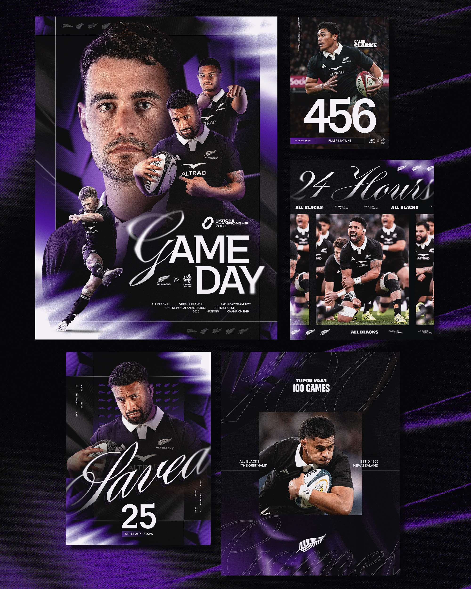
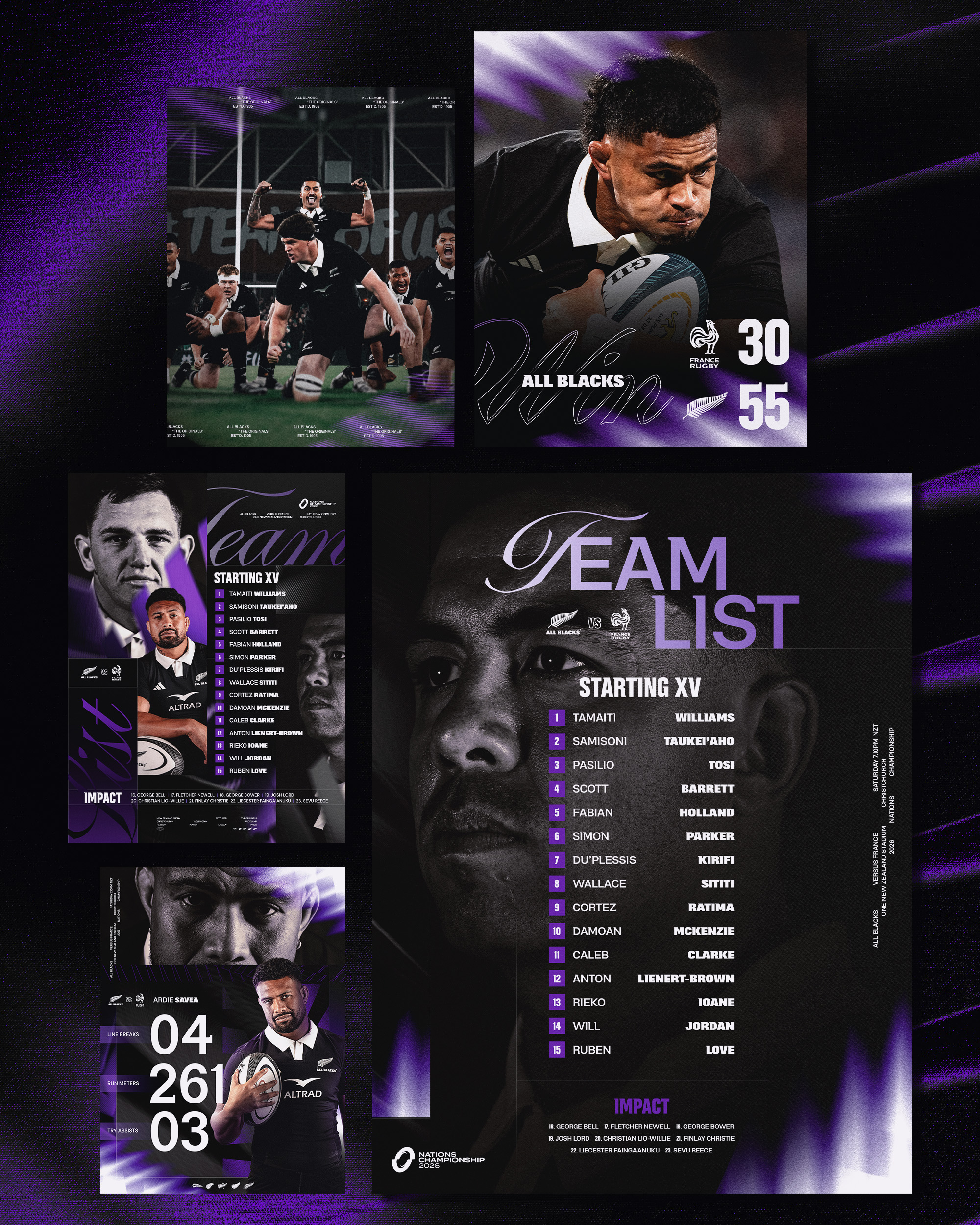
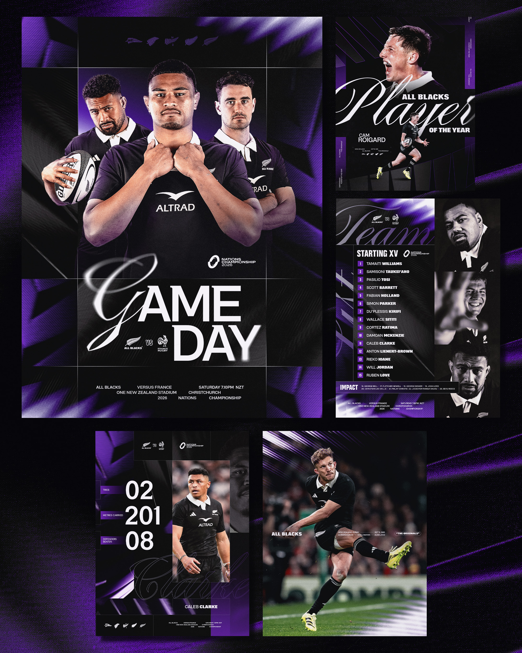
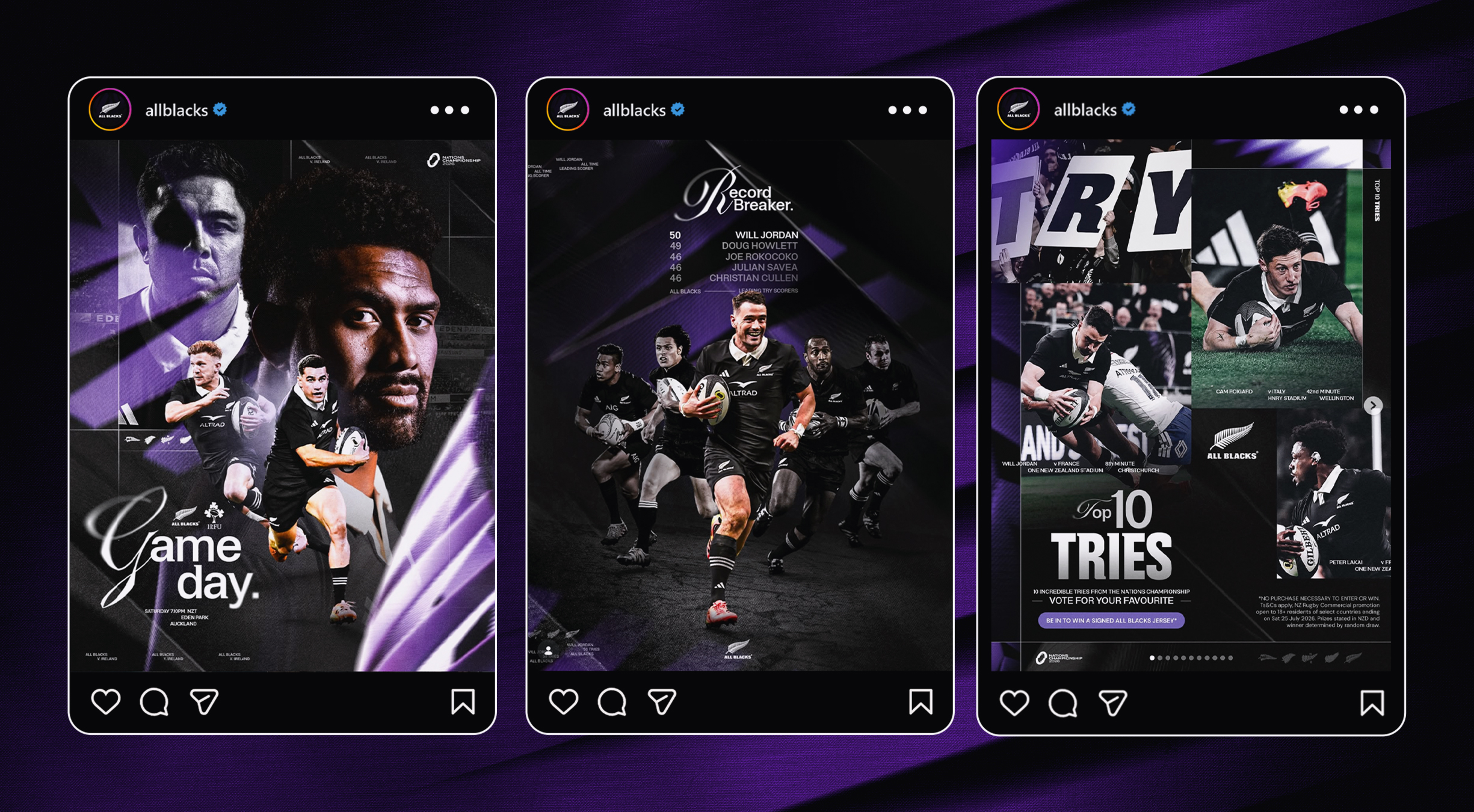
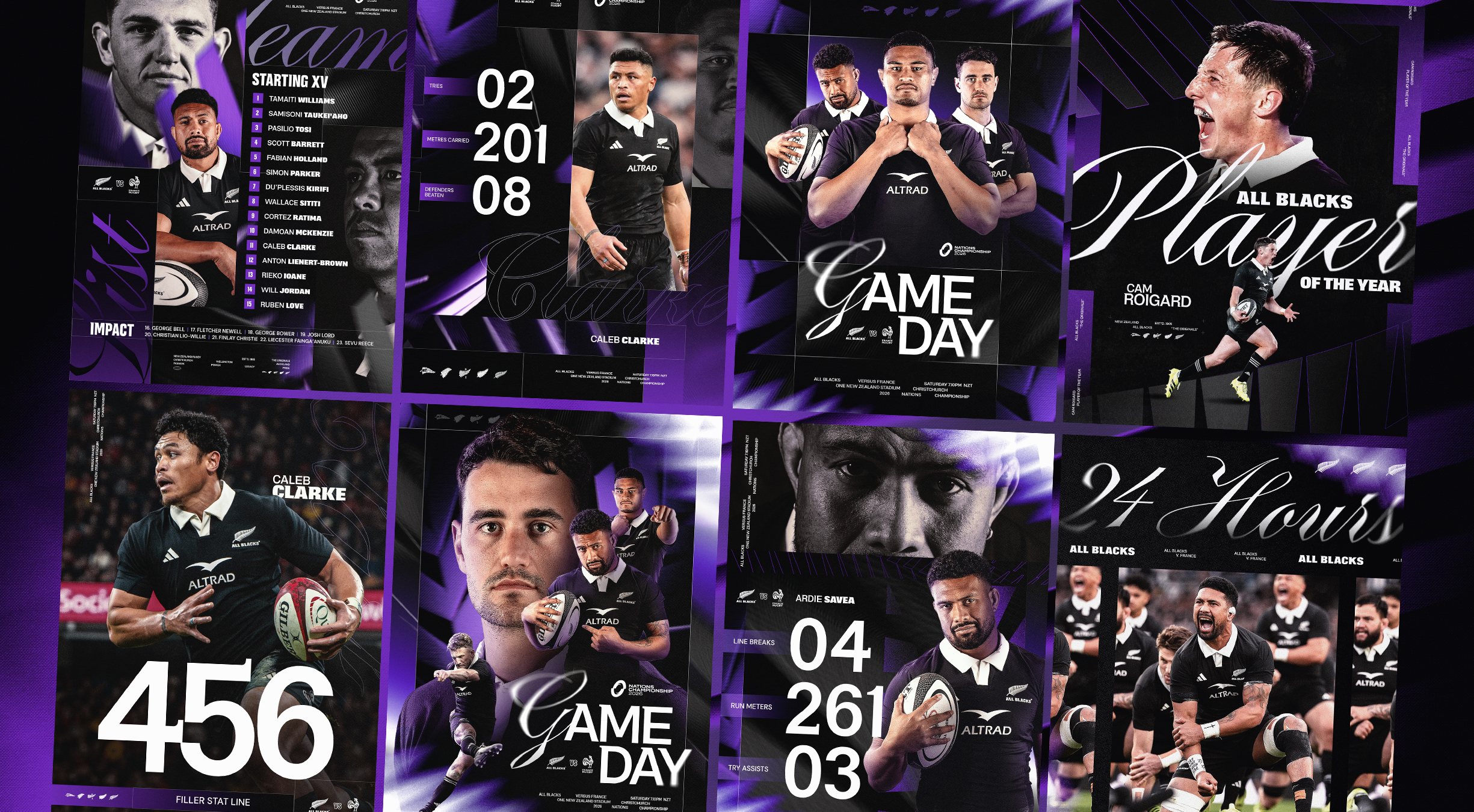
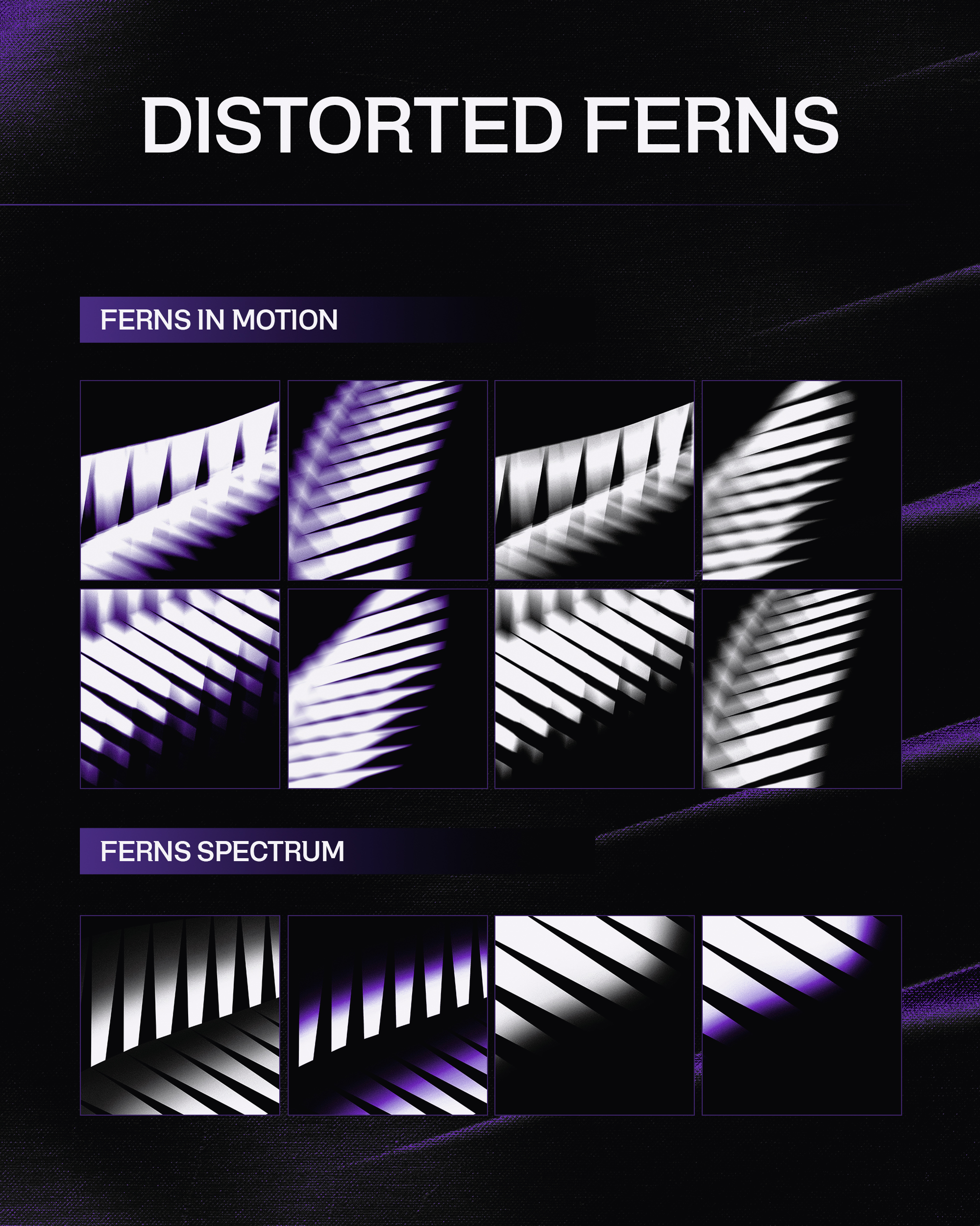
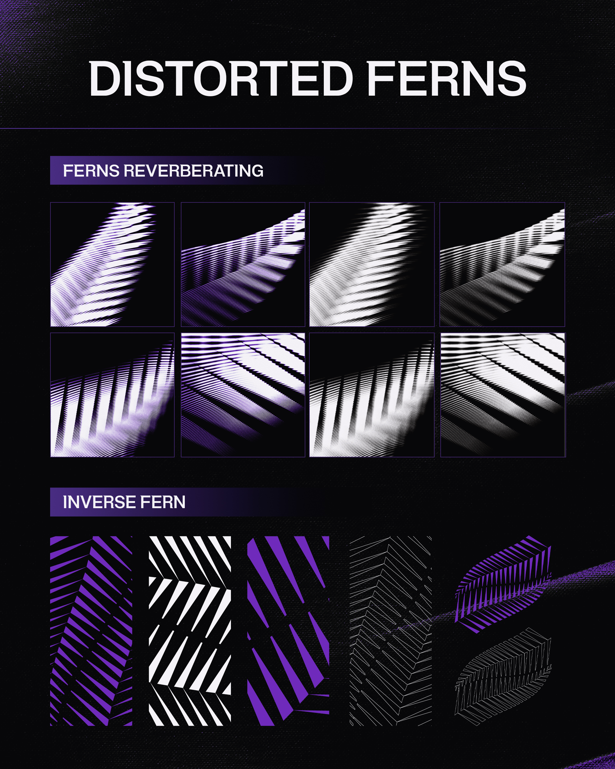
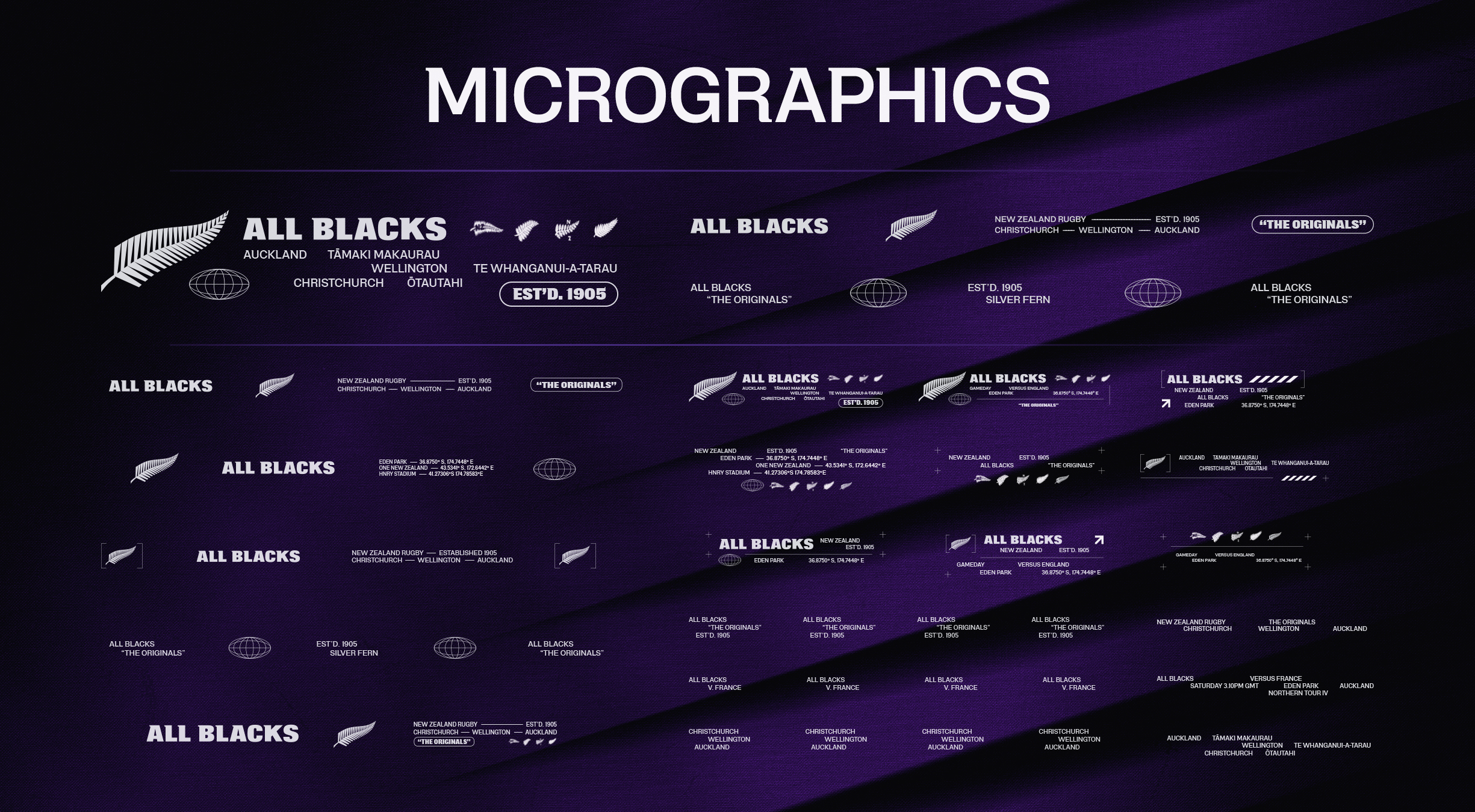
We developed a broader visual toolkit made up of typography, graphic assets, textures, patterns and flexible layout approaches that could be mixed, layered and adapted depending on the story being told.
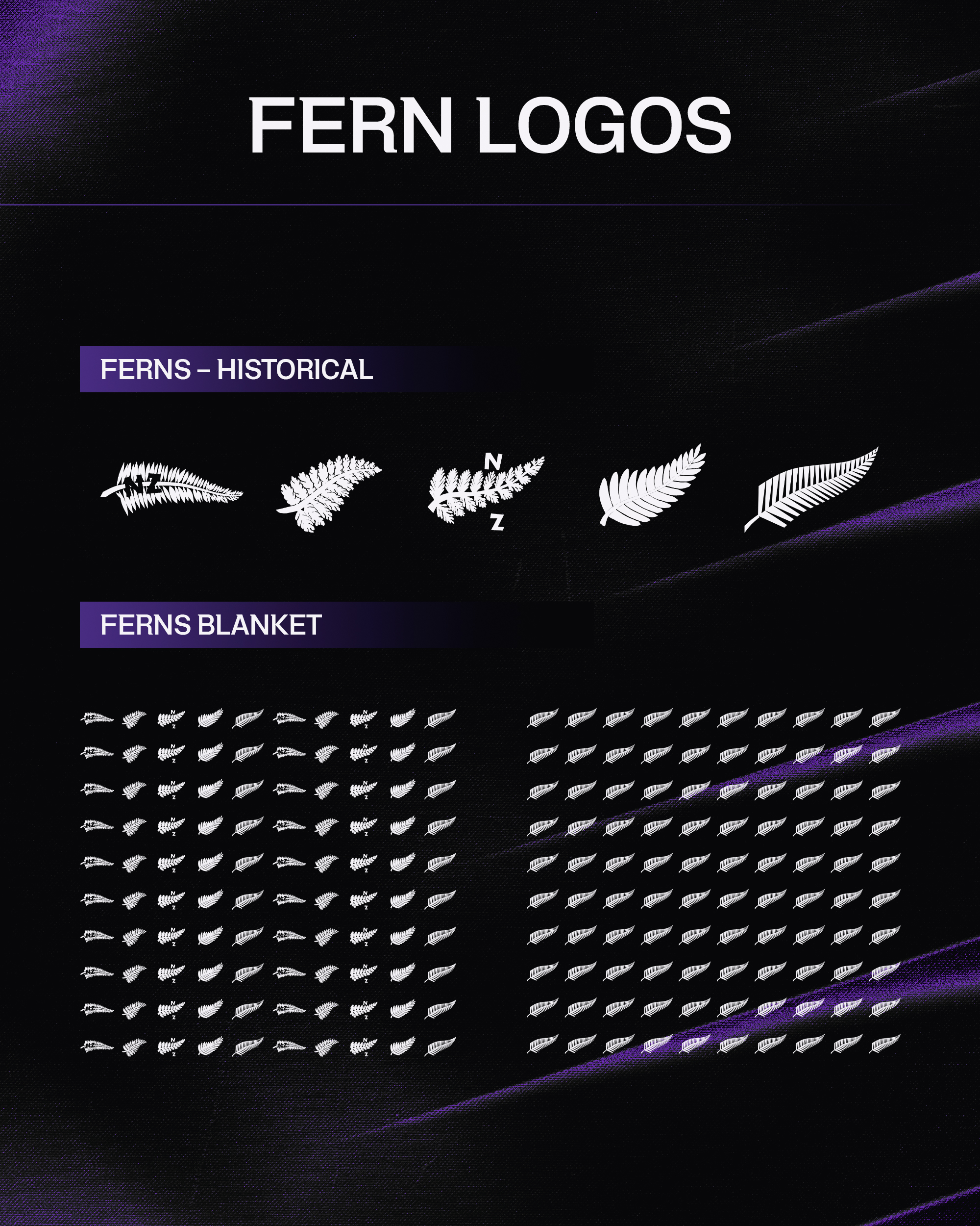
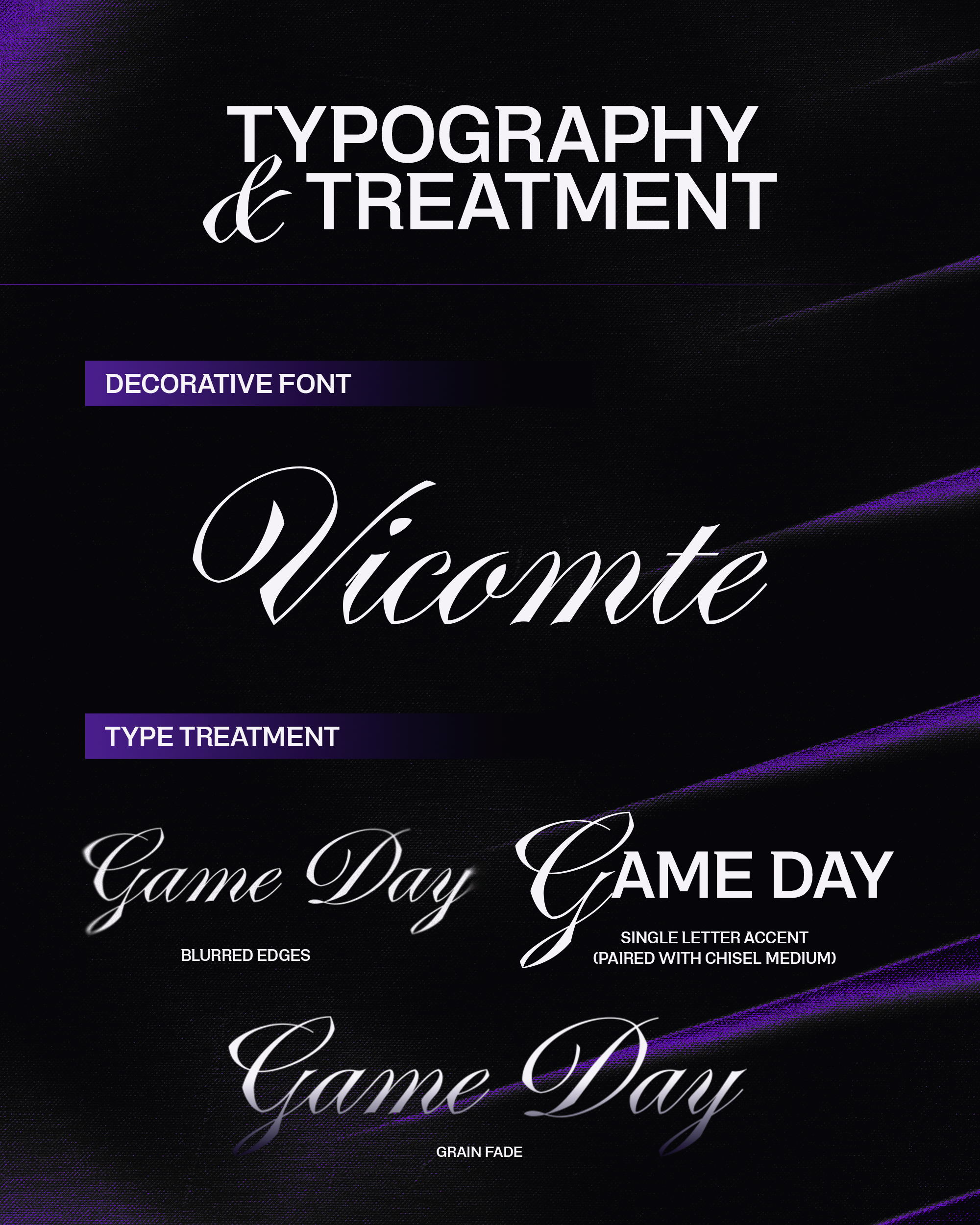
A bespoke script-style accent typeface introduced a more expressive and human element for selected moments, while fern-inspired motifs and patterns created another way to reference one of the most recognisable symbols of the All Blacks.
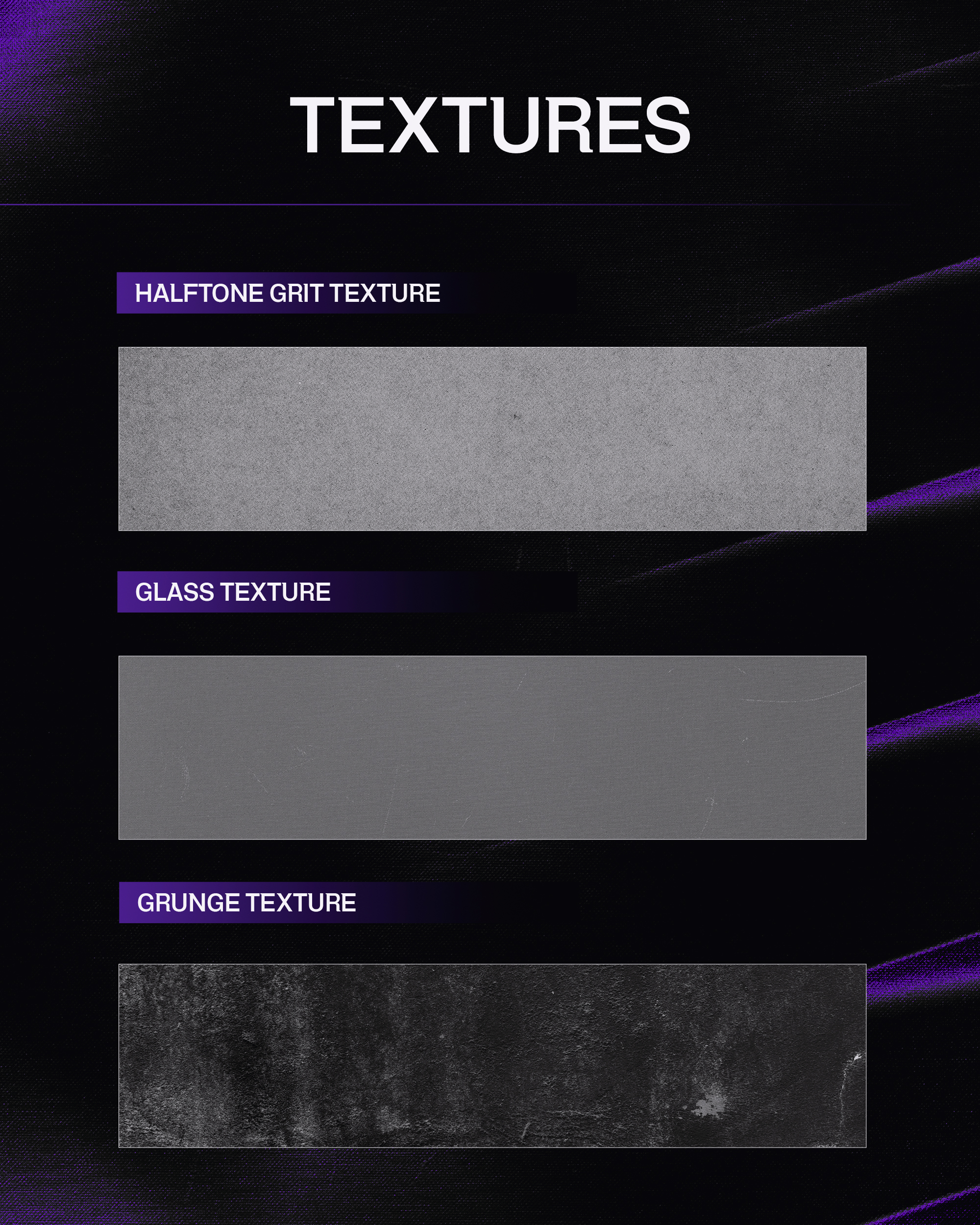
We also looked beyond traditional sporting references, drawing texture and visual inspiration from New Zealand's natural environment to give the system more depth and another connection back to place.
Importantly, none of these elements were designed to compete with the existing identity. They were there to support it. The system could be dialled up for expressive campaign creative or stripped right back when the All Blacks' core assets and imagery needed to do the talking.
The result was a larger creative toolbox, with clear enough rules to maintain consistency and enough flexibility for designers to keep finding new ways to use it.
Outcome:
The finished toolkit gave the All Blacks and their creative teams a broader visual language to work with without losing the simplicity and recognition of the existing brand.
Instead of replacing what was already working, the project added new layers that could be used when and where they were needed - giving campaigns, athlete stories, social content and everyday communications more variety while still feeling like the All Blacks.
Most importantly, the system was built to keep working beyond an individual campaign or season. It gave the brand a flexible creative foundation that internal teams and partners could continue to use, adapt and build on over time.